
Wishi App
April 2024
This UX project is dedicated to developing a Wishlist app, with a primary focus on crafting an optimal user experience, ensuring a consistent and user-friendly interface. The main emphasis lies in creating intuitive features for adding, organizing, and prioritizing items on a user centric wish list solution
Problem
This case study looks at the problems users face in making, organizing, and sharing wish lists for different occasions. Especially for those handling multiple wish lists, adding and organizing items is a bit tricky. Sharing with friends and family is also a challenge. The main issue is that the current system makes it tough for users to smoothly achieve their wish list goals. We’re working to fix these problems, aiming to create an app that’s easy to use, customize, and collaborate on, ultimately making the wish list experience better for everyone.
Background
The idea for this project came from the personal experience of the project owner, who wanted to create a wish list app that helps people make their dreams come true. The project owner realized that most of the existing wish list apps focus on materialistic desires and do not provide enough motivation and support for users to achieve their personal goals and aspirations. The project owner also noticed that there is a lack of social feedback and recognition in the current wish list apps, which can affect the users’ self-esteem and satisfaction.
Role
Lead UX/UI designer
Skills
- Figma
- Figma Jam
- Zoom
- Illustrator
- Maze
- Notion
- Miro
- Otter.ai
Process
- Empathize
- Define
- Design
- Illustrator
- Prototype
- Test
- Reflect
Primary Research
The primary research methodology contributed to a comprehensive understanding of the landscape, enabling us to discern vital areas for improvement and innovation within bill splitting features across peer to peer payment platforms. By comparing different payment platforms we aimed to gather insights into the strengths, weaknesses, and distinctive features of competing apps concerning their bill splitting functionalities.
Competitor analysis
The analysis reveals key trends and opportunities for our wish list app. While existing apps excel in certain areas, our app aims to combine the best features from existing apps, that combines advanced organizational tools, engaging and motivational features, seamless social sharing, and integration with popular e-commerce platforms.

Insights
This comprehensive competitive analysis provides insights into the strengths, weaknesses, and features of three popular wish list apps, catering to diverse target markets and user needs. Understanding these distinctions is crucial for developing a competitive and user centric wish list app that addresses the unique preferences of our target audience.
01 Empathize
Research goal
We want to enhance the user experience of the wish list app by understanding user behaviors, preferences, and pain points, ultimately leading to the development of a user
centric and efficient platform.
Objectives
Interviewees
Surveys
Minutes interview
02 Define
Affinity map
After conducting this method, we noticed that the user is focused on motivation, organization, and goal achievement, often sharing progress on platforms like Instagram for motivation. They value revisiting wishes, using focus mode for daily goals, and finding inspiration from quotes.
Their ideal app would track goals visually with pictures, integrate with e-commerce, offer reminders, provide inspiration and rewards, allow sharing and collaboration, include travel and dining goals, and offer privacy options and customizable organization.
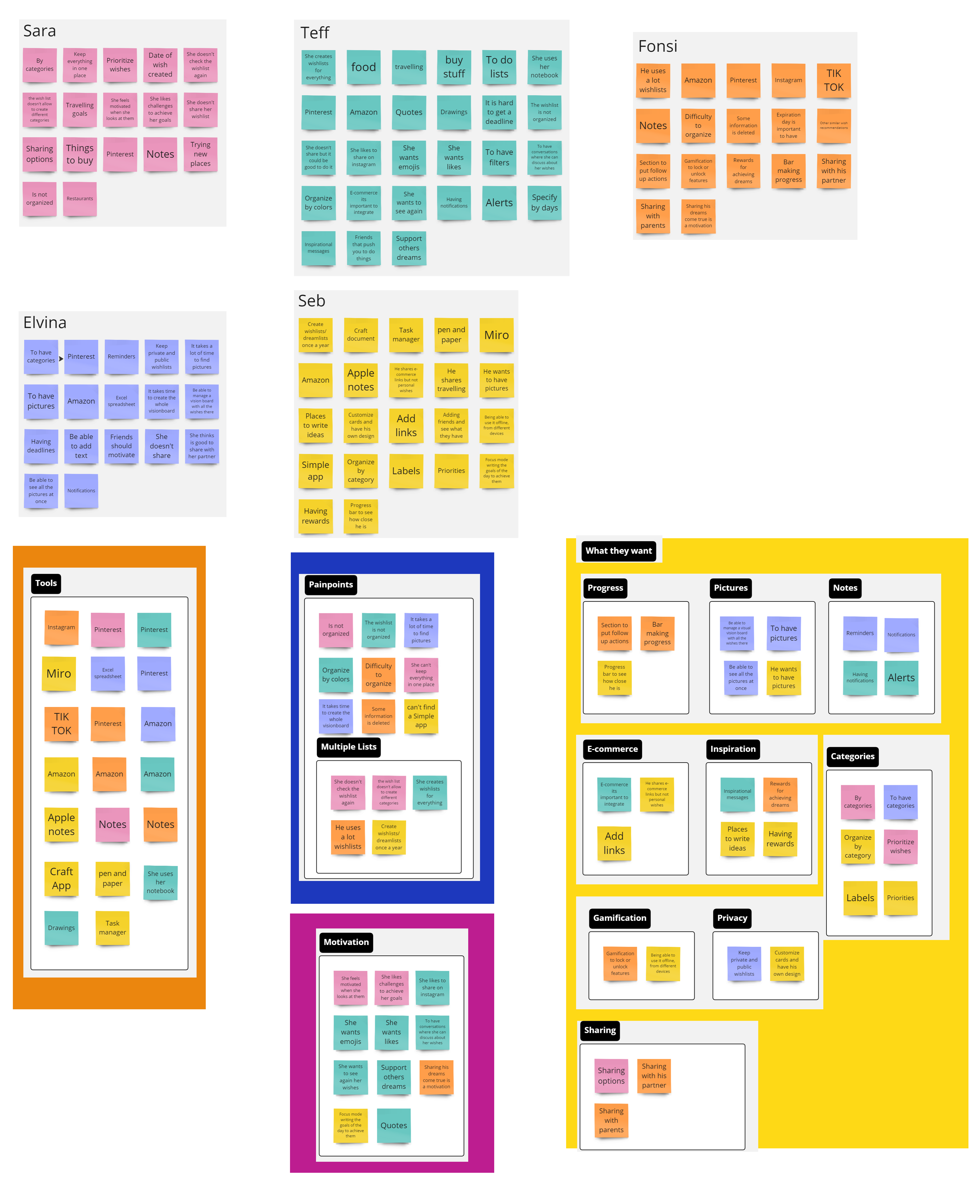
Synthesis Debrief
After conducting interviews with 4 participants and collecting feedback from 16 surveys
Important things to consider:
1
The chart suggests that creating wish lists is not a common or
regular habit for most people, also pen and
paper is still the most popular and preferred way of keeping track of wish lists.
2
The graph suggests that people value the social aspect of creating wishlists and want to share their ideas and preferences with their friends and family.
3
The graph reveals that the most common challenge, faced by half of the
respondents, is difficulty organizing items.
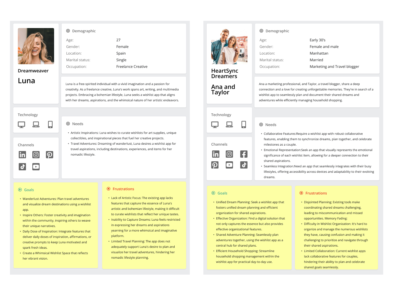
User Persona
Meet Alex and Taylor, the “DreamSync Duo,” a couple in their early 30s who love creating memories. They seek a wishlist app for organizing dreams and managing household tasks. Joining them is Luna, a visionary artist and aspiring entrepreneur in her mid-20s, looking for motivation and organization in her goals. Together, these personas inspire us to develop a solution that fosters collaboration, organization, and motivation for users like Alex, Taylor, and Luna.
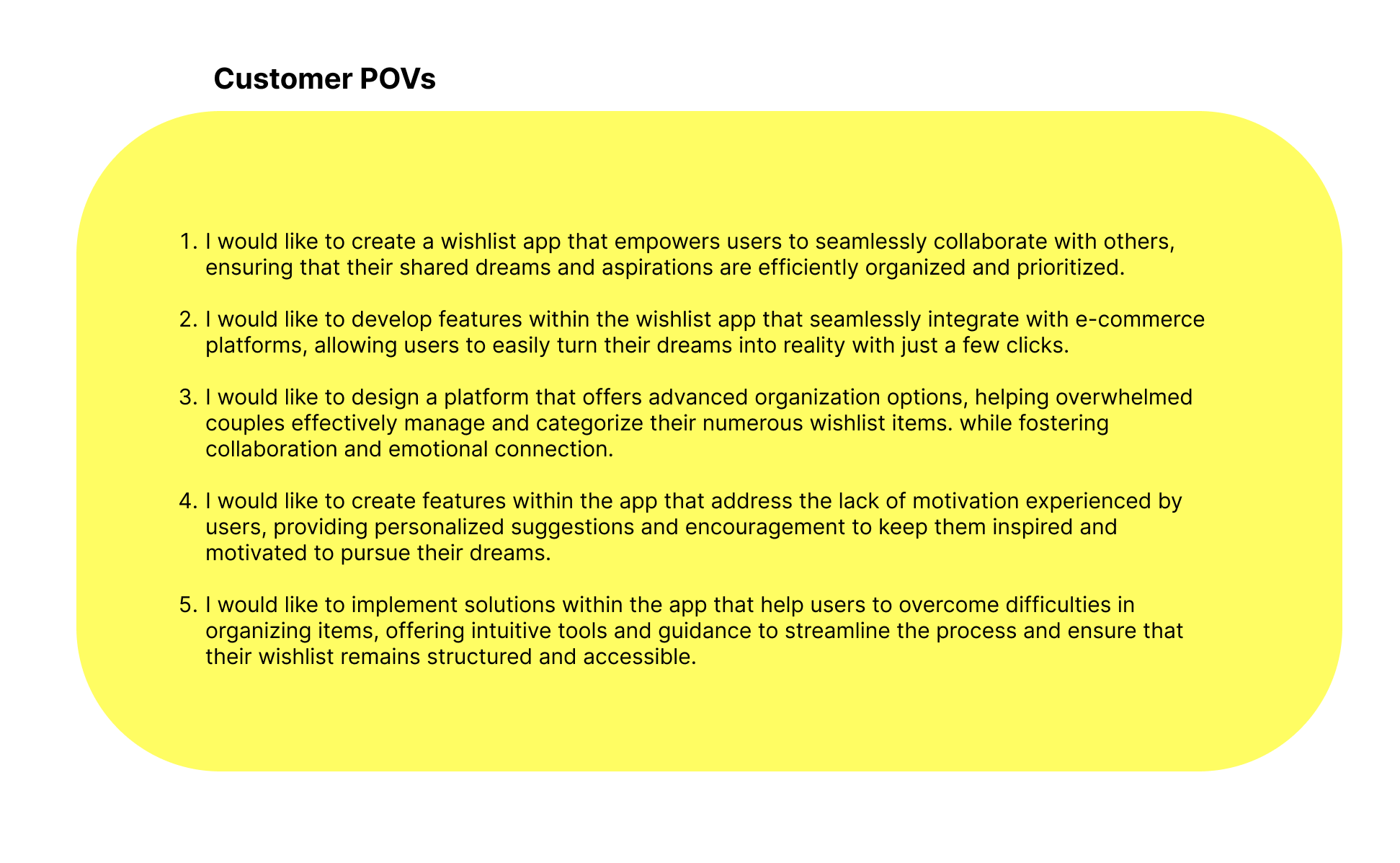
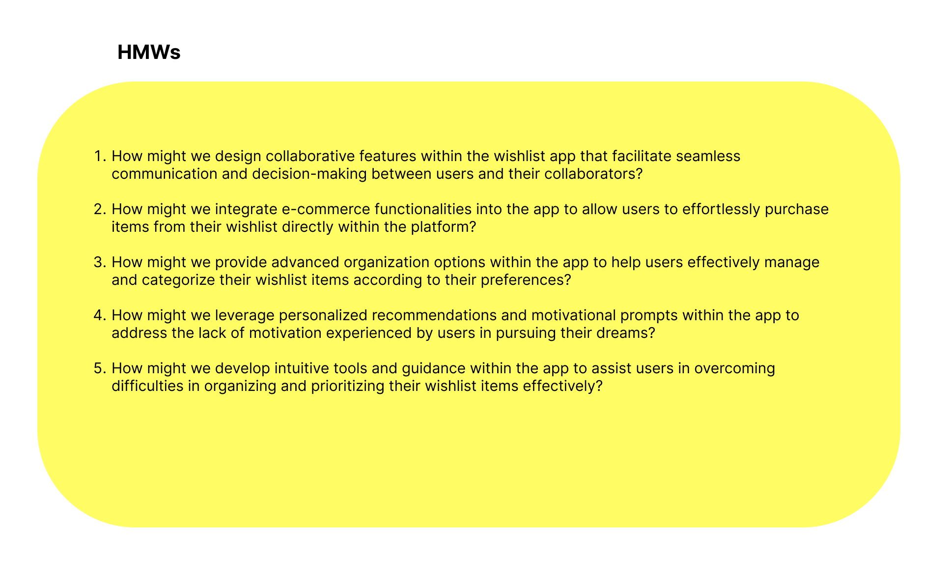
03 Ideate
How might we (HMW)
My journey towards crafting a game changing wish list app is guided by key insights encapsulated in Point of View (POV) and How Might We (HMW) questions.
These questions focus on making collaboration effortless, integrating e-commerce, offering advanced organization, boosting motivation, and simplifying organization hurdles.
Through these questions, I aim to build a user-friendly solution that not only addresses users’ challenges but also empowers them to turn their dreams into reality with ease.
1.
Help designers focus their design attention on opportunities
2.
Respond to the needs and insights uncovered during the research
3.
Generate targeted ideas.
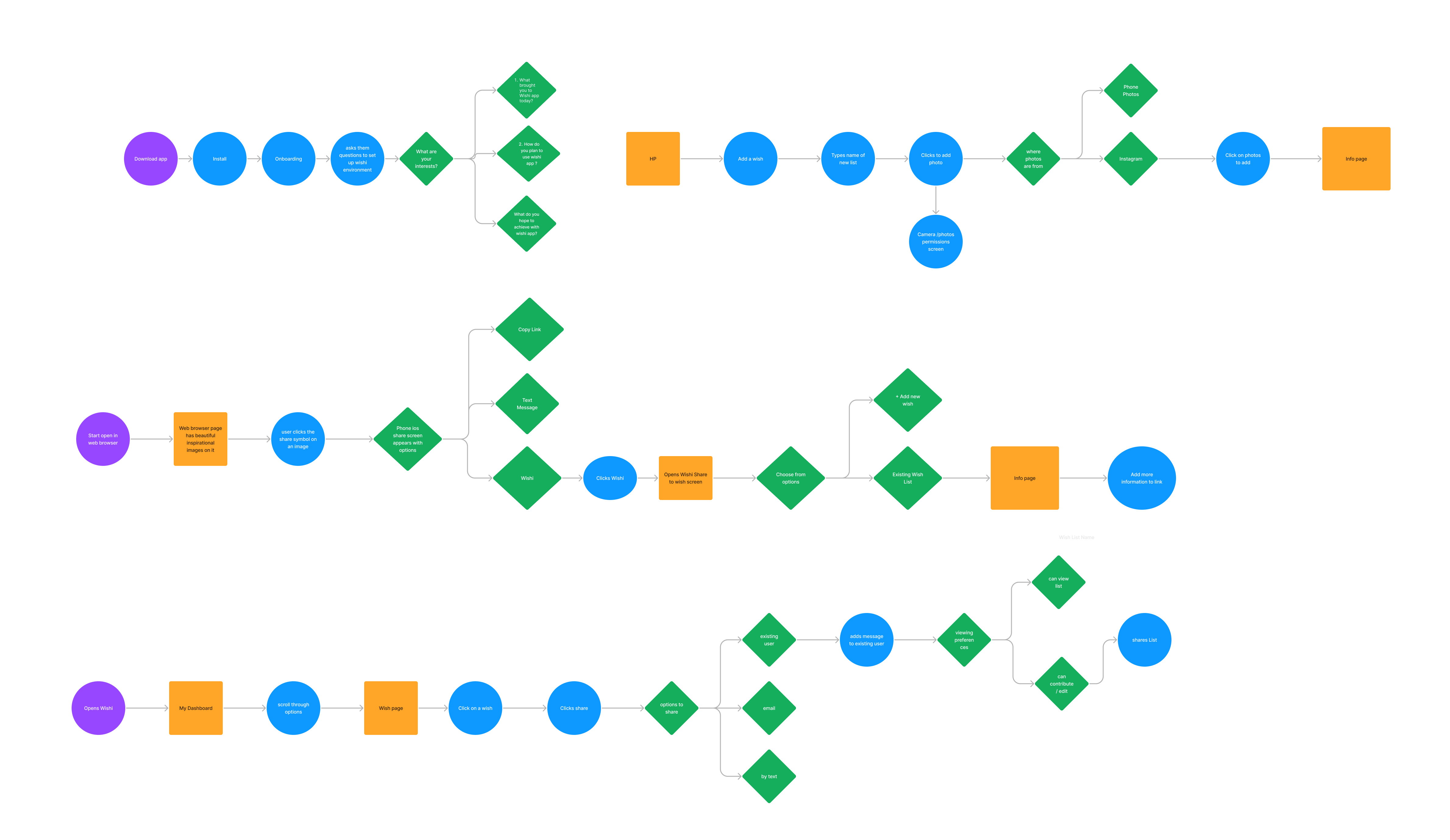
Task flow
The task flow illustrates how users like Alex, Taylor, and Luna can efficiently use the wish list app to organize dreams, collaborate seamlessly, and manage tasks effectively. Starting with account setup and adding wishes to their wish list app, users add details, media, and tags to aspirations. Collaborative planning enables partners to prioritize items and organize wish list content smoothly.
04 Design
The design process in UX/UI is like a creative adventure where we use technology to make digital things easy to use and beautiful. We start by thinking about what people need and then we draw and build to make those ideas real. It’s like putting together a puzzle, where each piece like buttons and pictures fits just right to create something that’s fun, helpful, and easy to understand.
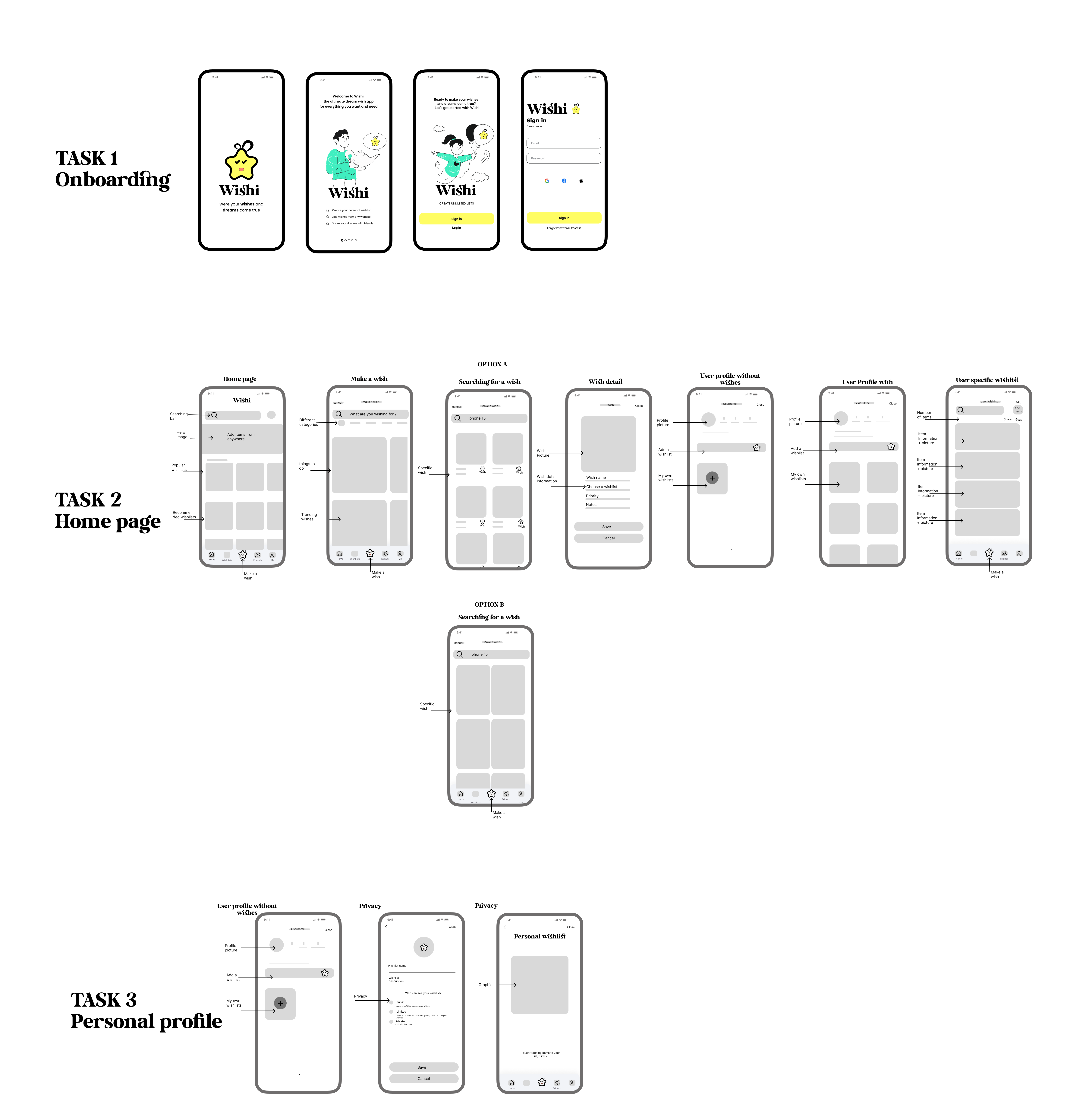
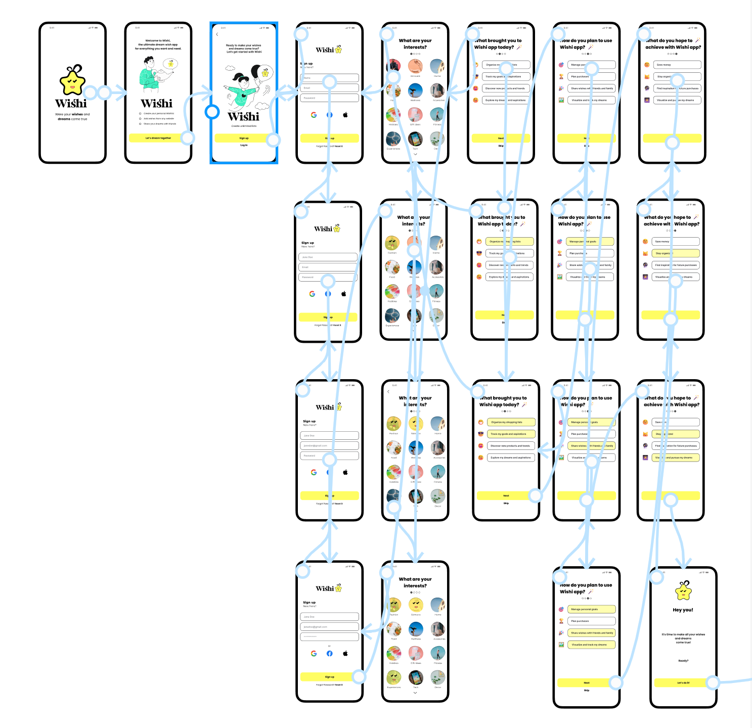
Low fidelity wireframes
Branding
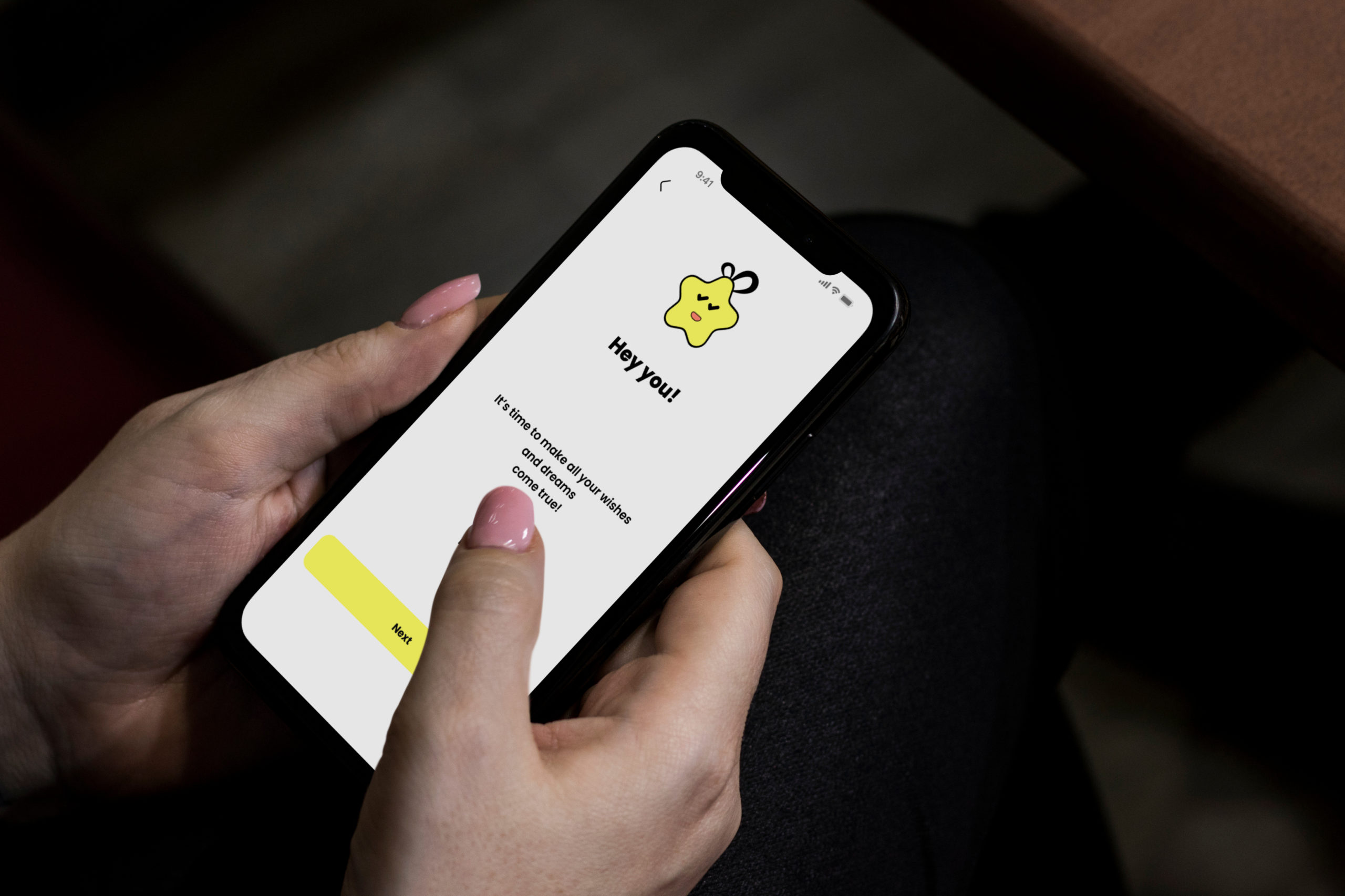
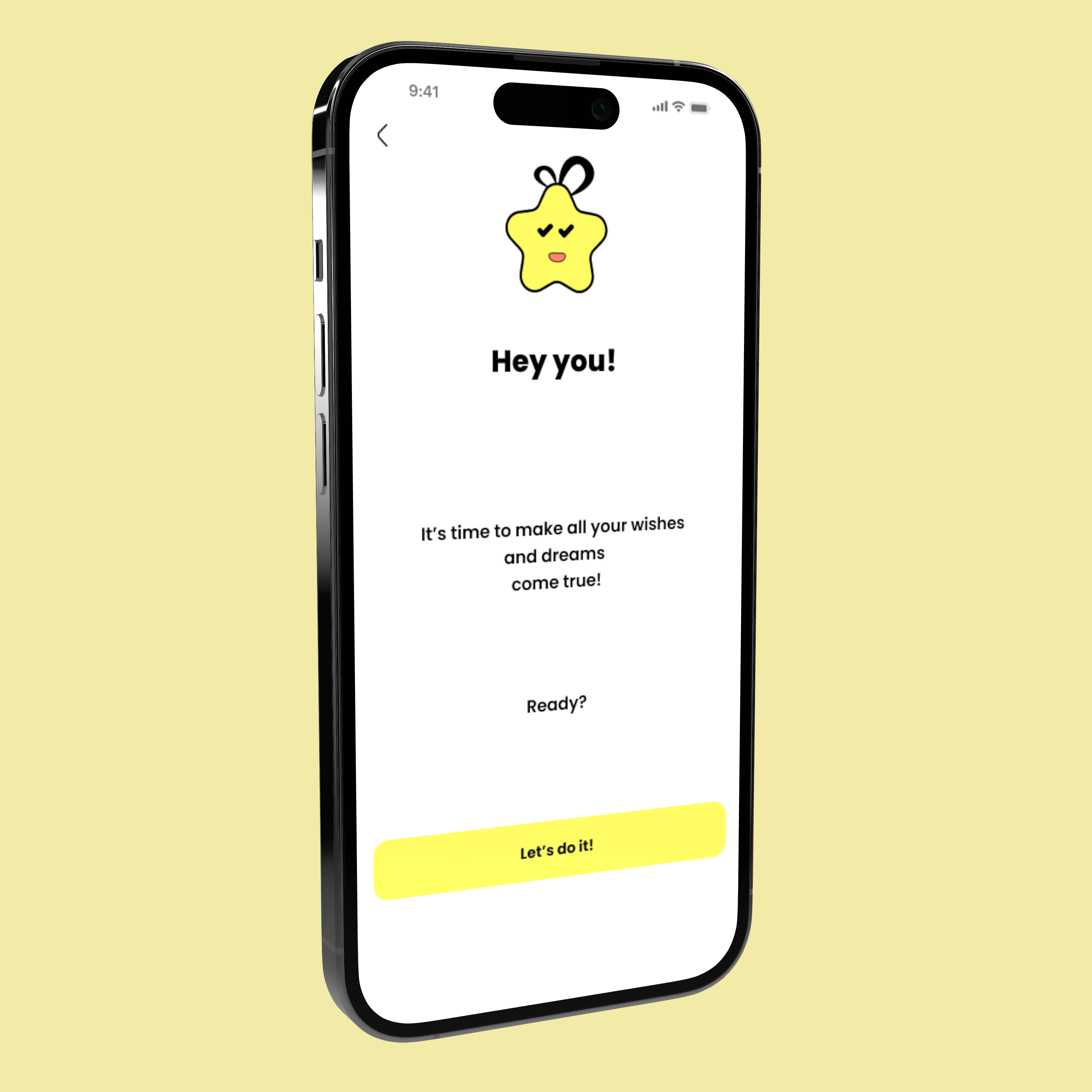
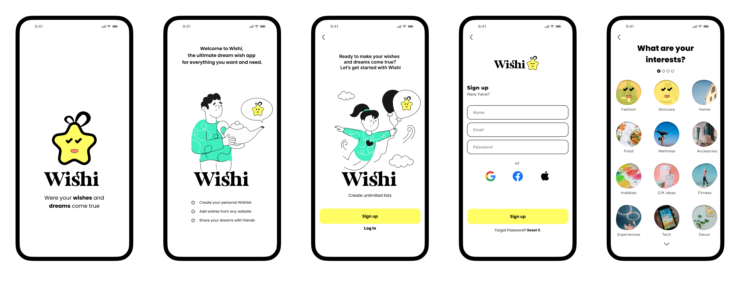
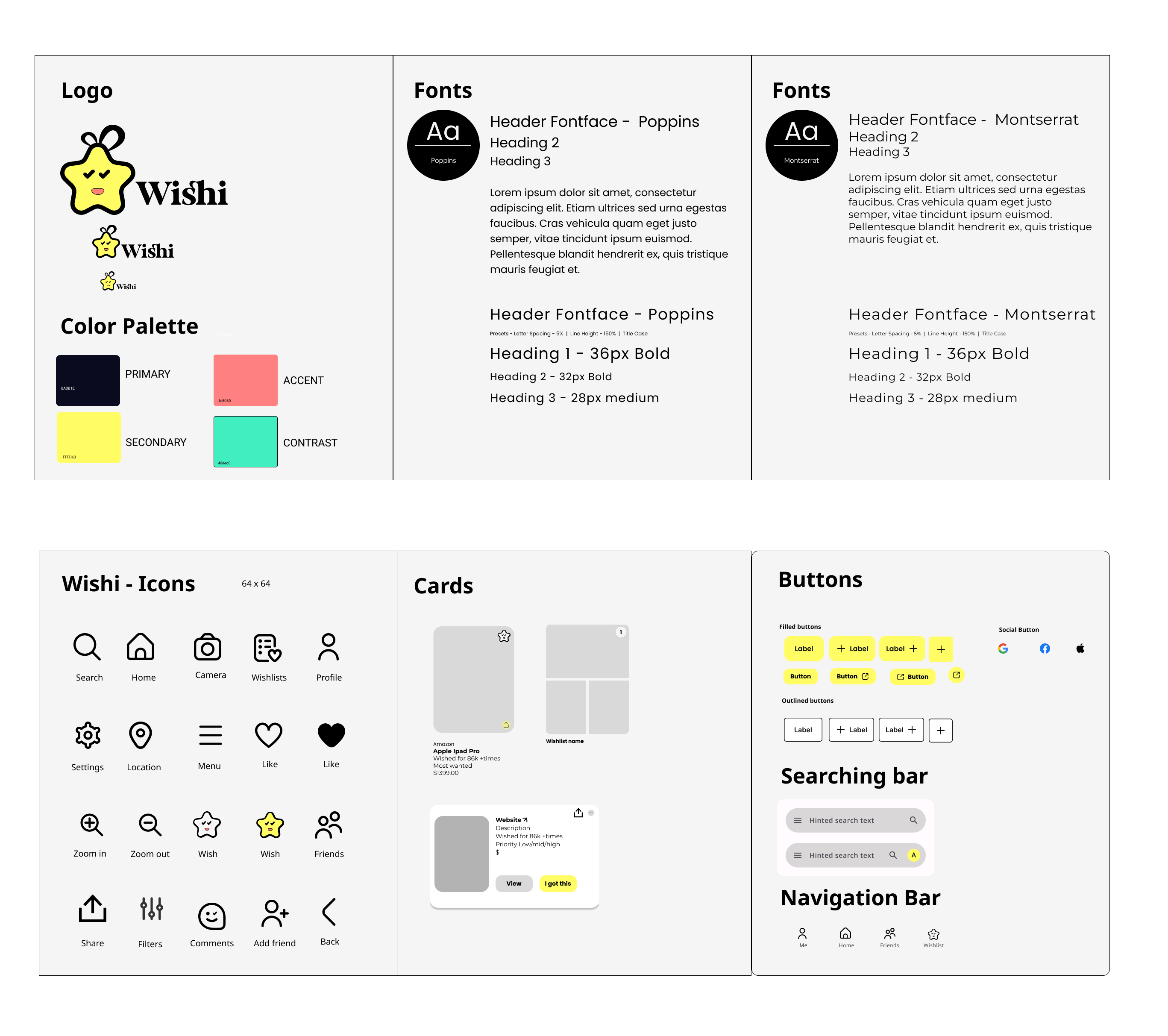
The branding for the wishlist app features a bold and vibrant identity centered around a yellow star logo, symbolizing aspiration and achievement. The main color palette includes yellow and black, conveying energy and sophistication, while secondary colors like green and pink-orange add playful and creative accents. The overall design exudes simplicity and intuitiveness, reflecting the app’s ease of use and collaborative nature. The brand message emphasizes empowering users to transform dreams into actionable goals, fostering motivation and personal growth. This branding approach aims to resonate with users seeking organization, collaboration, and inspiration in their pursuit of realizing their dreams.
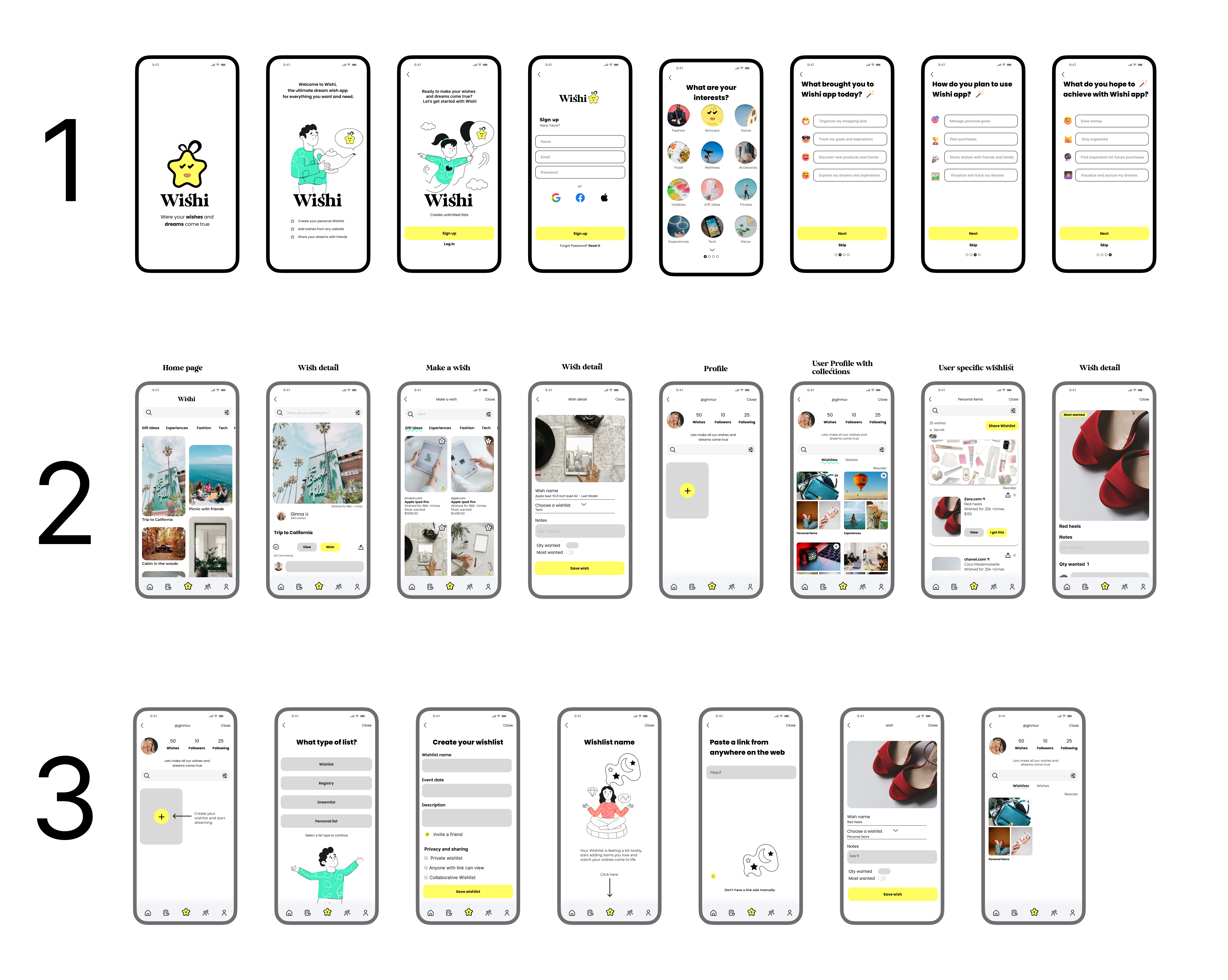
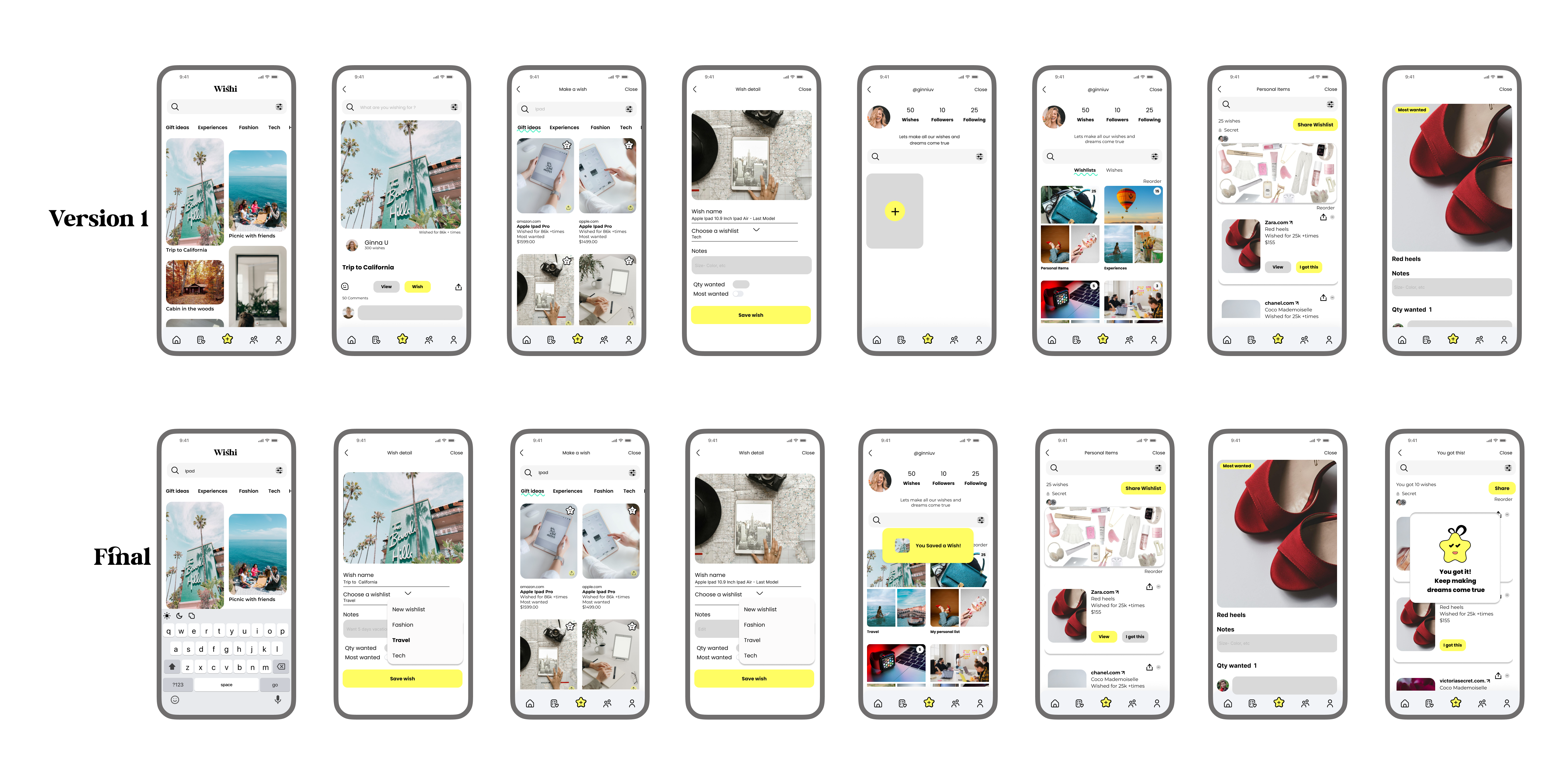
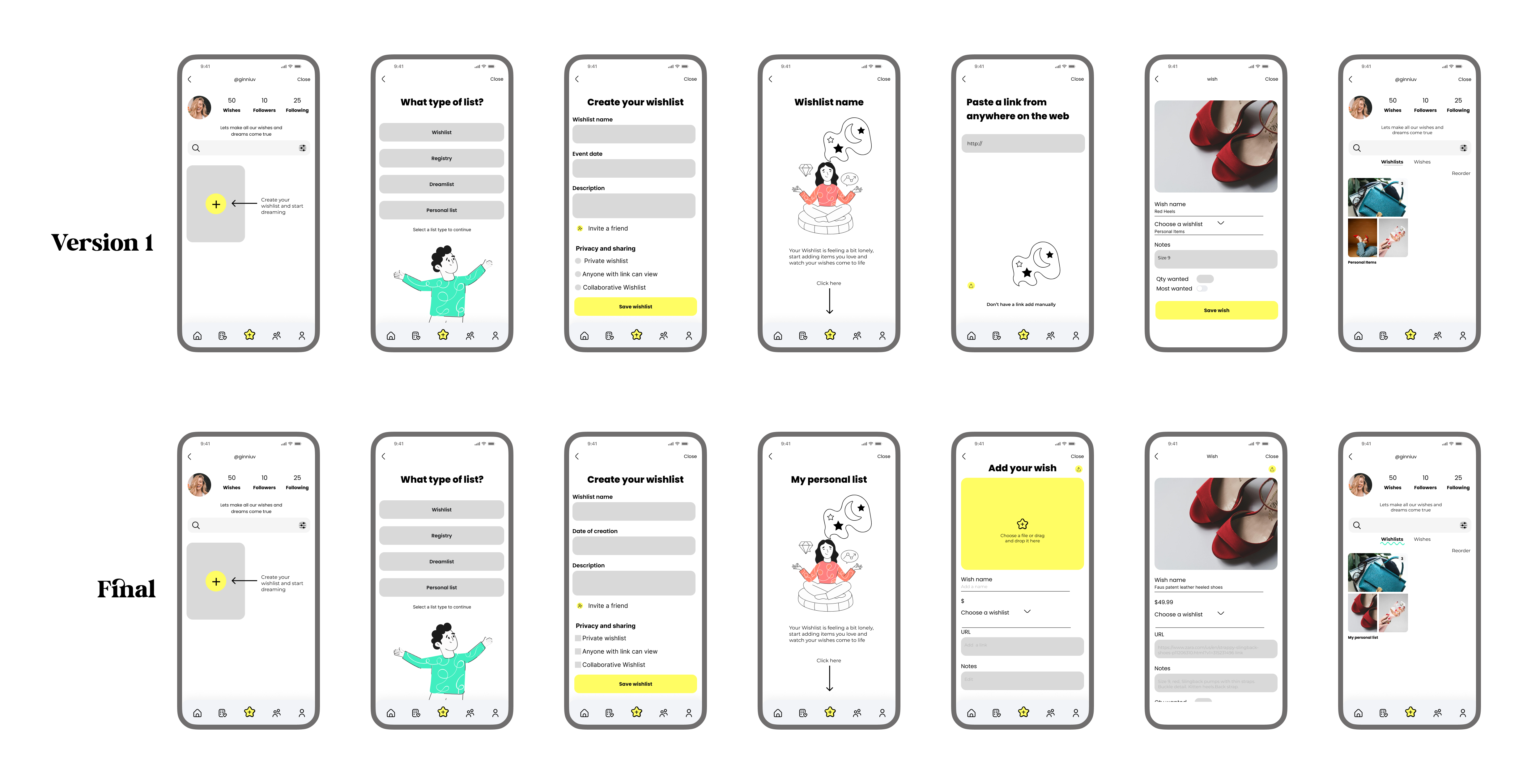
High fidelity wireframes
Testing
I crafted a high fidelity wireframe prototype using Figma. By engaging 4 participants in usability tests different tasks, and also testing 12 people on Maze. I gained valuable insights to refine the prototype and enhance user experience.
Tasks
Before proceeding to the detailed designs, I conducted a usability study with 12 users to test the prototype. Each user performed various tasks to evaluate the prototype’s functionality and provide feedback. This process aimed to assess the ease of use of the prototype and identify areas for improvement. The feedback gathered from this study will inform refinements to the final designs, ensuring an optimized user experience.
1. Sign up
2. Add a wish from exploring page
3.Create your own wish list
4. Explore profile
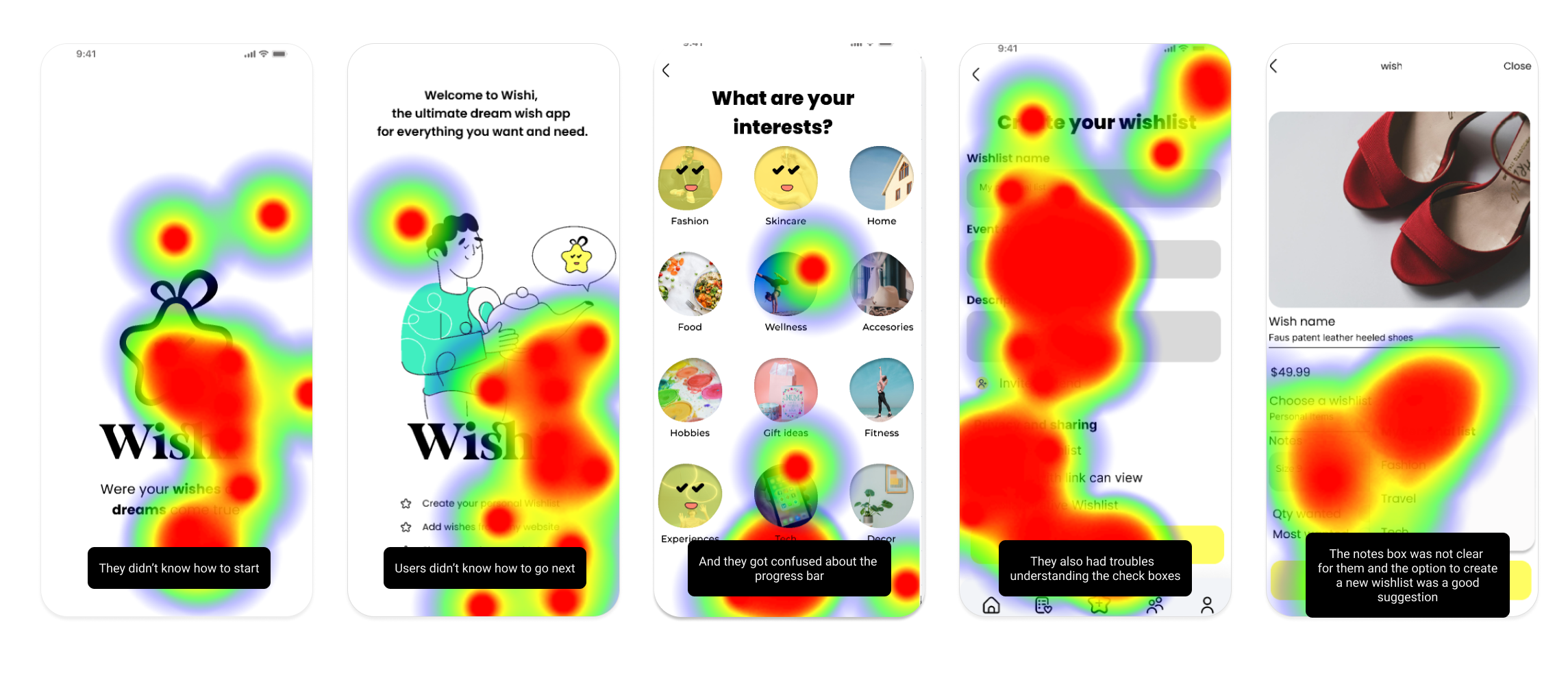
Task 1:Sign up
While this task was straightforward for most users, some encountered challenges with starting the task and were confused by elements such as the progress bar and vertical scrolling on the interests screen. However, aside from these issues, overall completion was relatively easy for participants.
Percentages
- 58.3% direct success
- 49.4% misclick rate
- 100% of the users where able to finish the task
Scenario
- Users where able to start signing up but some of them suggested CTA buttons to continue
- Also they got stuck on the interest part because they didn’t know they had to scroll down
Overall impressions
- It was easy but got confused for lacking of some buttons
- They liked the design and illustrations
- They liked all the elements and the color palette
Task 2: Add a Wish from exploring page and explore profile
While some users successfully completed the task, others encountered difficulties adding the “California” wish to their wish list, often due to pressing the wrong button. During individual interviews, participants found the task straightforward and were able to complete it without issue.
Percentages
- 65% direct success
- 25% misclick rate
- 100% of the users where able to finish the task
Scenario
- Users specific focus was on the travel wish list feature. The task was to add their California dream to the wish list, using a simple picture to vividly capture and preserve it within their travel aspirations.
Overall impressions
- The task was clear
- Some participants recommended having an option to add their own wish list directly within the current section, avoiding the need to navigate to another area of the app.
Task 3: Create a new wish list
When some users tried to create a new wish list, they encountered challenges and did not find the process straightforward. The flow was disjointed, making it difficult for them to navigate through each screen smoothly.
Percentages
- 50% direct success
- 66% misclick rate
- 40% of the users where able to finish the task
Scenario
- The task was to create “My Personal List” and add a pair of red shoes to it. This task allows users to explore the app’s customization features, ensuring that their wish list reflects their individual tastes and needs.
Overall impressions
- It was confusing to find the option to create a wish list from scratch
- They preferred a better instruction when they had to add a link for their own wishes
- They preferred square shape for checkboxes instead of circles
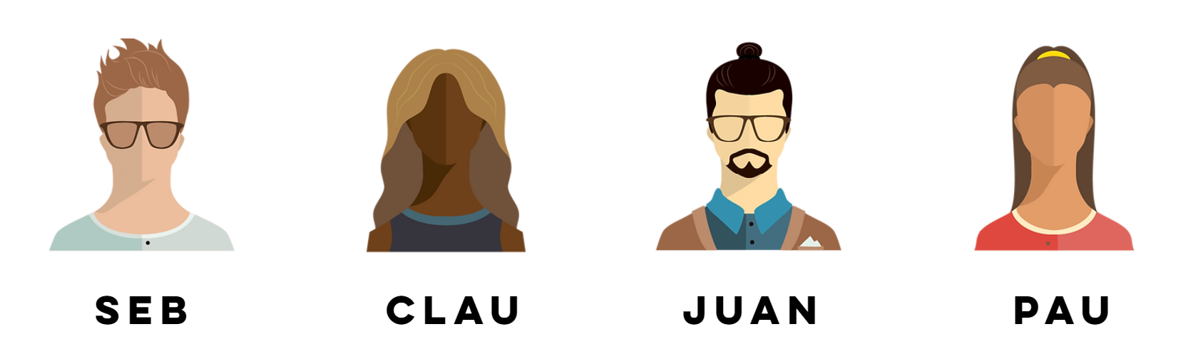
Usability test results
Based on the feedback from Paula, Claudia, Seb, and Juan, it can be summarized that the app is generally easy to use and user-friendly. Users appreciate the clear instructions and motivational elements. However, there are some areas of improvement, such as privacy settings and adding items to the wish list.
Testimonials & Reviews
Some Insights From Users

Paula E
Paula specifically mentioned the potential of a wish list feature, including sharing with friends and family. She also suggested having a new wish list option for personalization.

Seb
Seb found the app nice overall, but got confused during the sign-up process due to the lack of a continue button. He suggested moving the progress bar and appreciated the visuals and the ability to focus on wishes and pictures.

Juan
Juan struggled with scrolling down to view interests and suggested adding a feature to save previous achievements. He found the app straightforward and liked the animation when receiving wishes.

Claudia
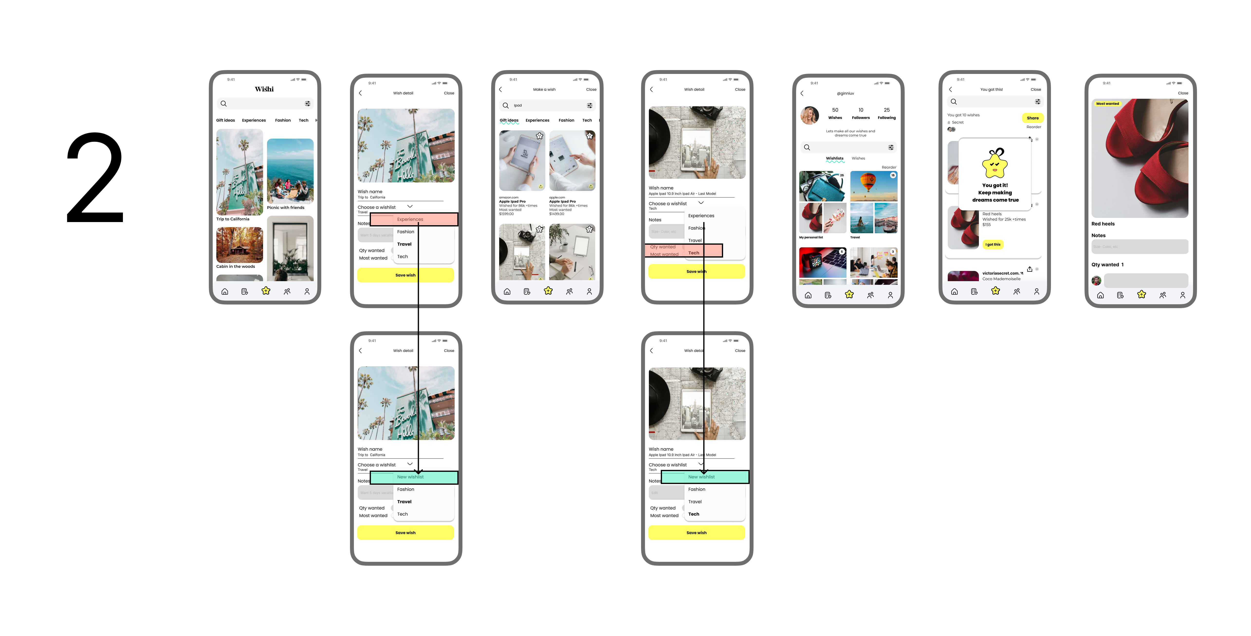
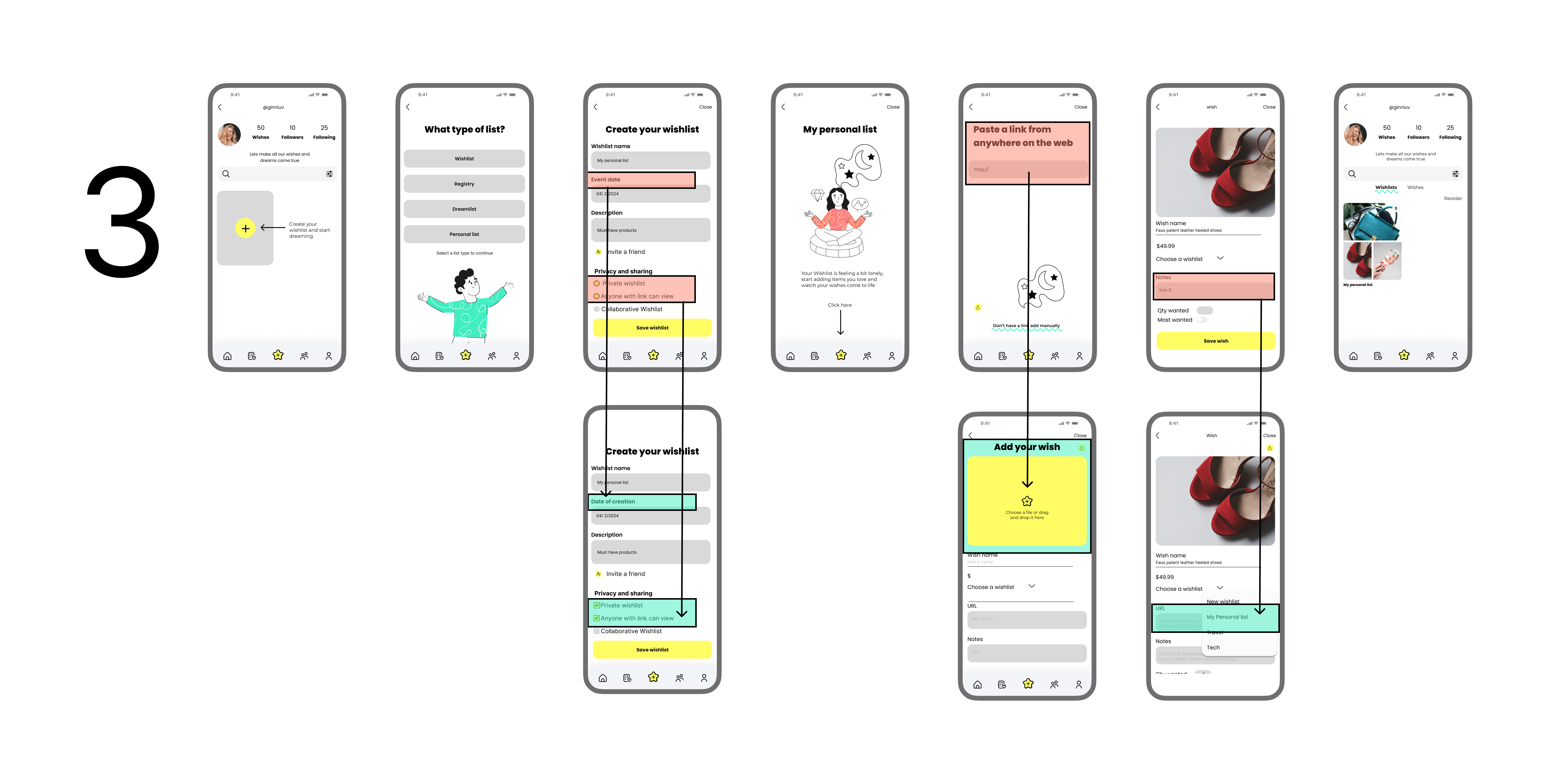
Claudia liked the intuitive and playful nature of the app, but suggested placing the progress bar on top for better visibility. She initially misunderstood the design element with dots but eventually understood it was a progress bar. She also recommended changing “event date” to “creation date” and labeling the comment box on wishes as “edit”. She felt that there were missing checkboxes on Wishlist privacy.
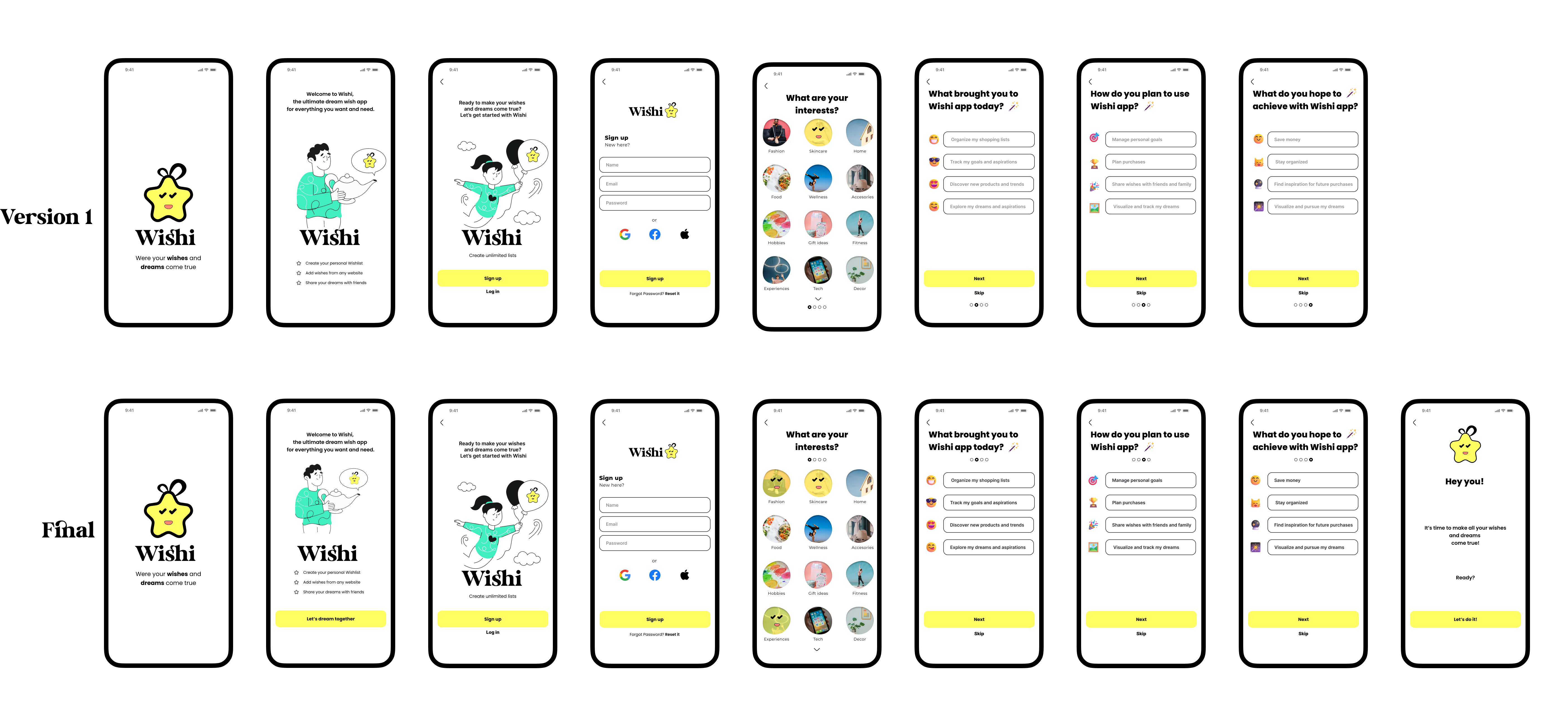
High priority revisions
Overall, the testing had positive outcomes as all users successfully completed the tasks. Feedback from the users highlighted the website’s refreshing and user friendly nature, coupled with easy navigation. They said it had unique and professional appearance. However, there were recommendations for improvement, notably in terms of spacing between elements and alternative methods for interacting with images. Some participants pointed out that certain images were too small and exhibited pixelation issues, which emerged as areas for enhancement.
Prototyping
Creating the prototype for the wish list app was like crafting a dream journey for our users. We began by envisioning a world where Alex, Taylor, and Luna could seamlessly organize their aspirations. Sketches turned into wireframes, each line drawn with their needs in mind. As the design took shape, we brought it to life in a clickable prototype, eager to see our vision in action. Testing it with users felt like unveiling a magical tool – some navigated with ease, while others pointed out hidden obstacles. Every piece of feedback was a clue, guiding us closer to a flawless experience. By the end, our prototype wasn’t just a design; it was a collaborative creation, built with the dreams and voices of those who would use it.
Reflections and takeaways
Design in Figma
- Using Figma for the design and prototyping process proved invaluable. I could quickly iterate on designs, testing various layouts and functionalities to create an intuitive user experience. Figma’s prototyping capabilities enabled me to build interactive elements that closely mimicked the final app, providing a realistic testing environment.
Centered design
- The core of my process was a user-centered approach. By focusing on the needs and behaviors of Alex, Taylor, and Luna, I ensured that the design decisions were always aligned with real user expectations. This approach helped me to create features that are not only functional but also genuinely useful and engaging for our target users
Usability Testing and Interviews
- Conducting usability tests and interviews with 12 users highlighted the strengths and weaknesses of my prototype. These sessions revealed areas where users experienced confusion, such as starting tasks and navigating the progress bar and vertical scrolling. One-on-one interviews provided deeper insights into these pain points, allowing me to refine the user interface and flow. User feedback was crucial in identifying key improvements, such as adding the ability to create wish lists directly without navigating to other sections.
What is next
With the prototype polished and user feedback seamlessly incorporated, I embark on an exhilarating new phase.
As I make final adjustments, addressing usability issues, clarifying design elements, and implementing new features based on user feedback, I am crafting an app that resonates deeply with users’ desires. With each refinement, I ensure that every interaction speaks directly to their hearts and enriches their experience.
In this exciting phase, my focus is on not just meeting but exceeding user expectations, delivering a wishl ist app that is intuitive, engaging, and truly indispensable in helping users organize, collaborate, and achieve their dreams.