February- April 2023
Rentbox
Looking for a new place to live can be stressful and time consuming To enhance this experience, consider using Rentbox. This App is safe and efficient for finding a great place to live. With profile verification, accurate listings, and reviews, Rentbox helps you find the perfect place that meets your needs.
Problem
The pursuit of a new place to reside often becomes tiresome, particularly when individuals are uncertain about the ideal destination. This uncertainty can lead to stress and prolonged time investment. The challenge lies in reshaping this search into an exceptional journey – one that is both enjoyable and rewarding.
Background
Individuals in search of a new place to call home are driven by a multitude of reasons. Among them are those who have ventured to different cities or even countries to pursue educational programs, secure fresh employment opportunities, navigate expiring leases, or simply embark on a journey to embrace novel experiences in unfamiliar locales.
Role
Lead UX/UI designer
Skills
- Figma
- Figma Jam
- Zoom
- Illustrator
- Maze
- Notion
- Miro
- Otter.ai
Process
- Empathize
- Define
- Design
- Prototype
- Test
- Reflect
Primary Research
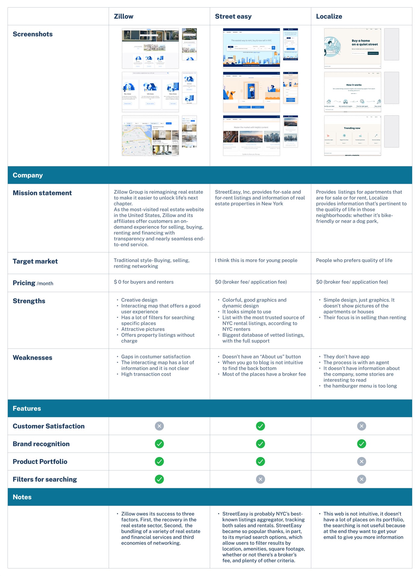
The development of the competitive analysis was a meticulous and multifaceted process that involved comprehensive research, systematic data collection, and insightful evaluation. The aim was to provide a well rounded perspective on the strengths, weaknesses, and unique selling points of Rentbox in comparison to its competitors.
Competitor analysis
The result was a comprehensive competitive analysis that not only highlighted Rentbox’s unique features but also provided an objective and well-informed comparison with its competitors. By meticulously developing this analysis, valuable insights were generated that showcased Rentbox’s potential to revolutionize the house-hunting experience and emerge as a standout player in the market.
Secondary Research
In a parallel research endeavor, a comprehensive investigation into New York City’s rental landscape unearthed compelling insights. Characterized by soaring rental costs, cutthroat competition, and a tapestry of diverse neighborhoods, renting in NYC is an intricate dance of challenges and opportunities. The intricacies of the city’s rental process, underscored by exacting application protocols and safeguarded by rent stabilization and rent control laws, provide a backdrop of complexity that shapes the user experience.
Moreover, the seismic tremors of the COVID-19 pandemic have reverberated within the NYC rental market, casting a spotlight on shifting dynamics. The surge in demand for more affordable housing alternatives in select areas showcases the evolving preferences of tenants in the wake of unprecedented global events.

01 Empathize
Understanding the user
Empathizing with and understanding the needs and perspectives of users is crucial in creating a positive user experience. By putting ourselves in the shoes of users, we gain valuable insights into their emotions, motivations, and pain points. Empathizing with users allows us to design and develop products, services, or interfaces that truly resonate with their needs and expectations. Through effective user understanding, we can create meaningful and impactful experiences that not only meet user requirements but also foster a deeper connection and satisfaction.
Research goal
To make the process of finding a new home smoother, it’s important to understand what people want and how they feel when they’re looking for one. By knowing their needs, preferences, and emotions, we can offer choices that match what they’re looking for. This way, searching for a place to live becomes an enjoyable journey where individuals don’t just find a new house, but a place where they can create new memories and experiences.
Objectives
- Understand the determinants that influence people’s decisions when they are looking for places to live
- Understand what kind of apps/webs/ services they use to research
- Analyze what difficulties the users present when they are looking for places
- Understand what is the process when starting the searching for a new place to live.
5
Interviewees living in NYC
25-35
years old
30
minutes interview
02 Define
Affinity map
This method is very helpful because it is Human-centered design and it is crucial to hear from users in their own words. It is also a good way to learn about a person’s mindset, interests, emotions, behavior, and lifestyle when it is time to make a decision
Synthesis Debrief
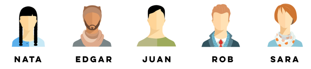
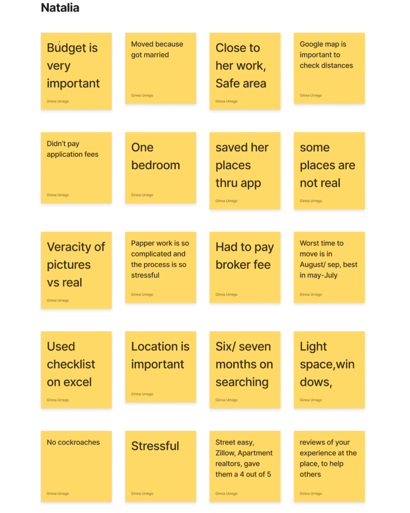
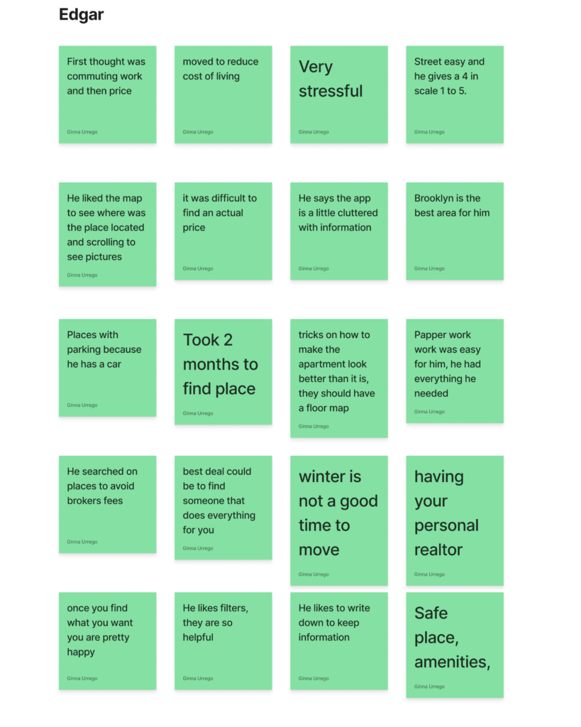
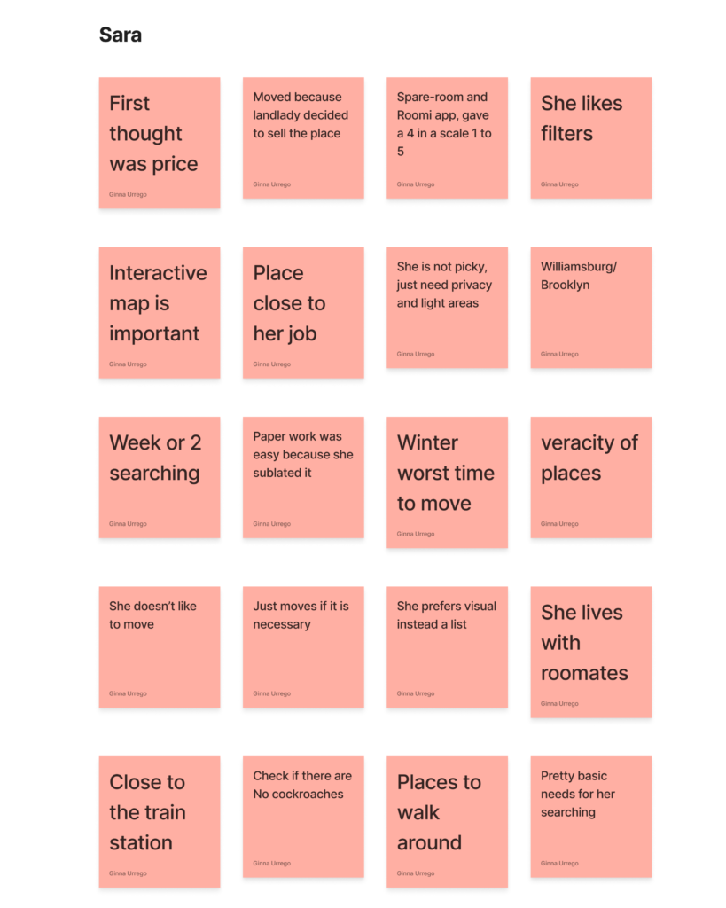
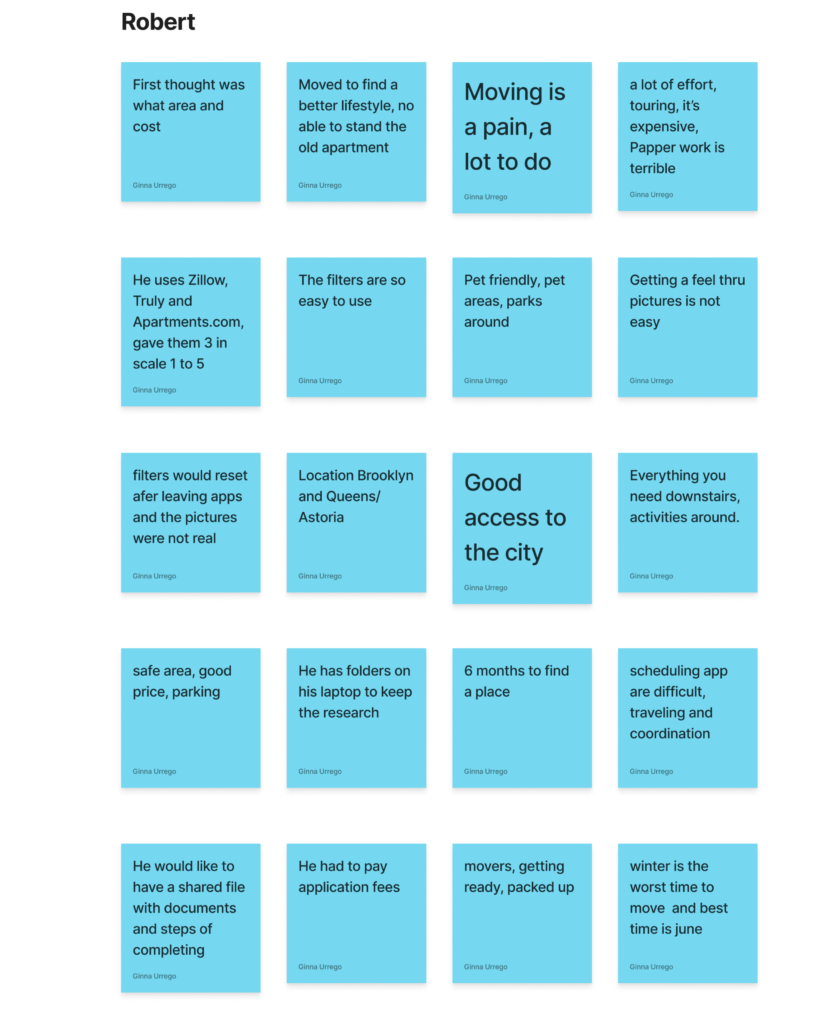
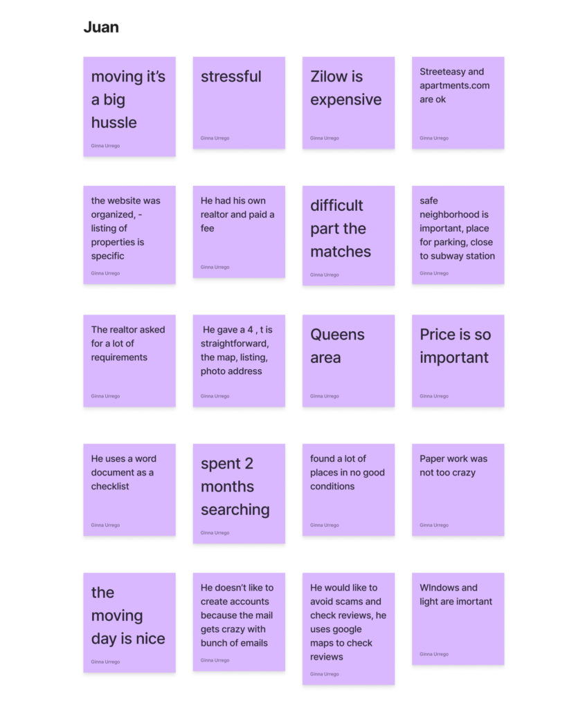
After the interviews with 5 participants, hearing what they said , about finding a new place to live and after hearing their feelings, pain points, I wrote all the information of different insights after that I sorted them into different patterns to understand better my audience.
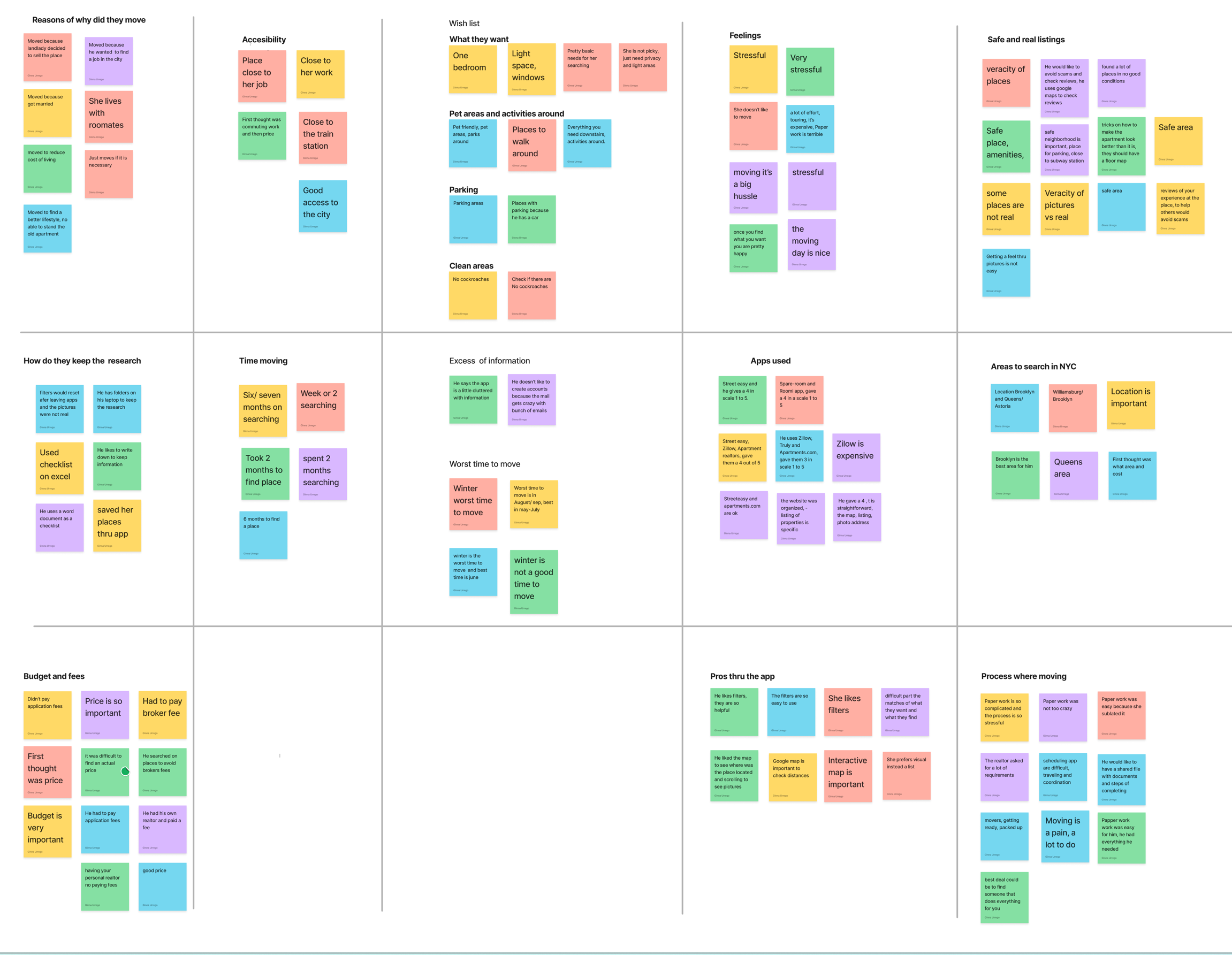
After the interviews with 5 participants, hearing what they said , about finding a new place to live and after hearing their feelings, pain points, I wrote all the information of different insights after that I sorted them into different patterns to understand better my audience.
I put similar pieces and grouped them into themes:
Feelings:
Most of the participants showed that are very stressed when they are moving, they said there is a lot of effort, plus it is expensive, the paper work is terrible but after all of that the moment when you find a place and after you move, they feel so happy
Important things to consider:
- The budget is really important for most of them
- They look for a place that is close to their job
- Google maps it’s a good tool to check distance
- The place should have good access to the city
- The location is really important
- Windows are important for most of them
- Filters on their research are so important because they can define what are they looking for and it is specific
What do they want:
- They want veracity of places
- Simple ways for paperwork
- Better visual, high-resolution pictures
- Places to walk around, everything you need downstairs
- A shared file with documents and steps of completing
- Safe areas, good prices and parking
- Not paying for any fees (applications and brokers)
- Having a realtor
- More places pet friendly, with areas for the pets
- Review the experience to help others
- Avoid scams
Pain points:
- The budget is really important for most of them
- They look for a place that is close to their job
- Google maps it’s a good tool to check distance
- The place should have good access to the city
- The location is really important
- Windows are important for most of them
- Filters on their research are so important because they can define what are they looking for and it is specific
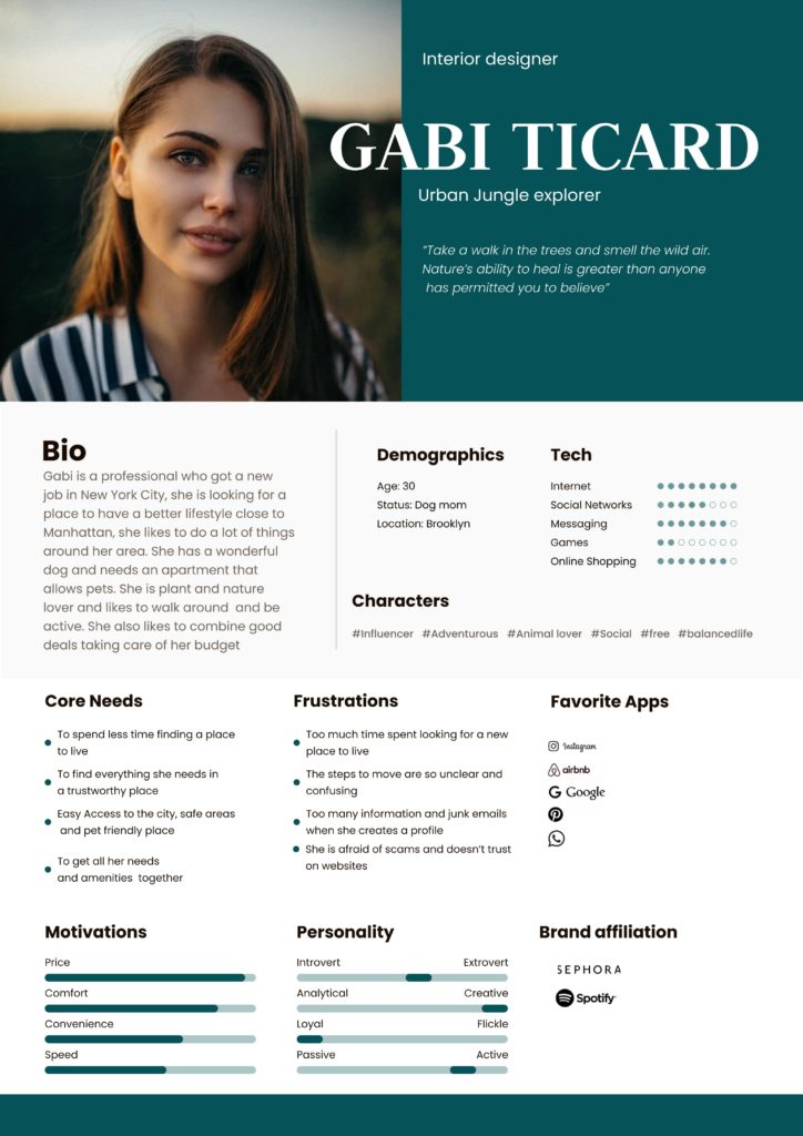
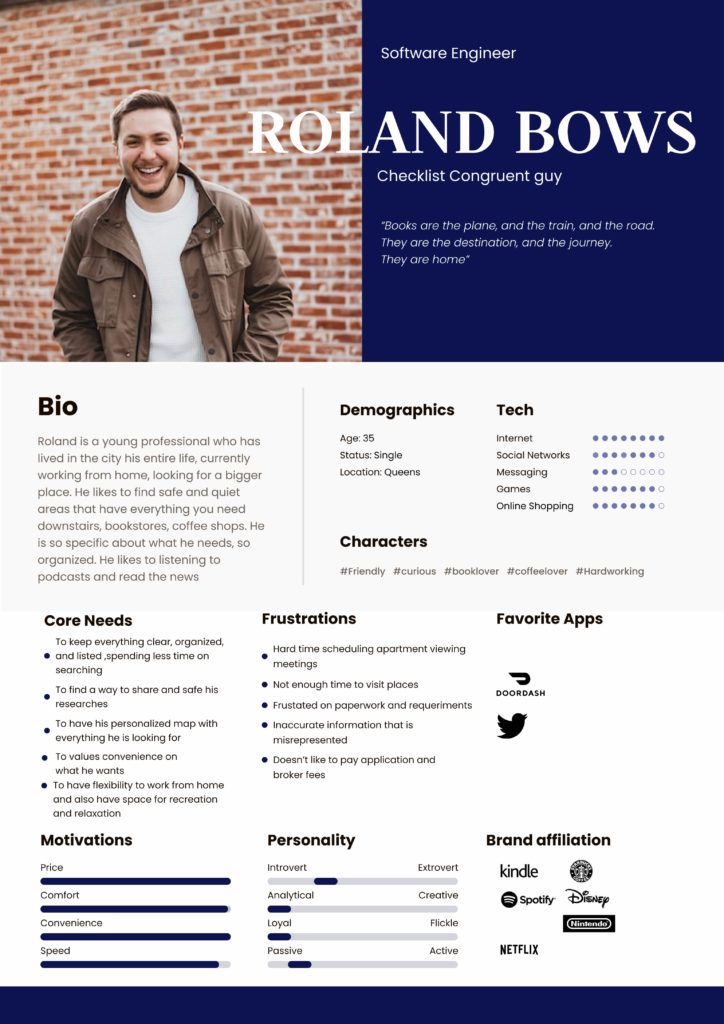
User Persona
User personas are crucial in the UX process as they provide a tangible representation of the target audience, enabling designers to empathize with and understand users on a deeper level. We create Personas to consolidate user research, demographic information, and behavioral patterns into archetypal representations, allowing us to make informed decisions based on user needs, goals, and pain points. By utilizing personas, we can effectively prioritize features, tailor interactions, and create meaningful experiences that resonate with the intended users, resulting in more intuitive and engaging designs that drive user satisfaction and business success.
03 Ideate
How might we (HMW)
1
Help designers focus their design attention on opportunities
2
Respond to the needs and insights uncovered during the research
3
Generate targeted ideas.
How might we
POV – HMW
POV: I would like to explore easiest ways to help young residents in NYC to feel less stressed through the searching for a new place to live because they are bothered with complicated paper work.
How might we make paper work process less stressful for people who are looking for a new place to live in NYC?
-How might we help young people with the paperwork to feel less bothered when they are completing the requirements for a place to live in NYC?
How might we
POV – HMW
POV: I would like to explore ways to help young people living in NYC to feel safe and confident when they are visiting places because they worry about scams
– How might we prevent young people in NYC to avoid scams when they are looking for a new place to live?
– How might we help young residents living in NYC to find accurate information and verify that is real when they are searching a new place to live?
- How might we verify the places to know they are not fake when people are looking for a new place to live in NYC?
- How might we make users feel confident they’ve found a safe place?
How might we
POV – HMW
POV: I would like to explore ways to help people who have pets to find pet friendly areas because they worry about searching places that allow animals
-How might we help people with pets to have a better experience in finding a new place to live?
-How might we help people finding pet friendly areas in NYC?
-How might we show them areas pet friendly in different neighborhoods?
How might we
POV – HMW
POV: I would like to explore ways to help young people in NYC to check simple details in the area where they are looking for a place to live because they struggle finding tricks or dislikes on the places.
-How might we make aware residents in NYC about some important details to have in mind when they are looking for a new place to live?
-How might we make more organized the individual needs when people are searching a new place to live in NYC?
-How might we make clearer the specific requirements that people are looking when they are searching for a new place to live in NYC?
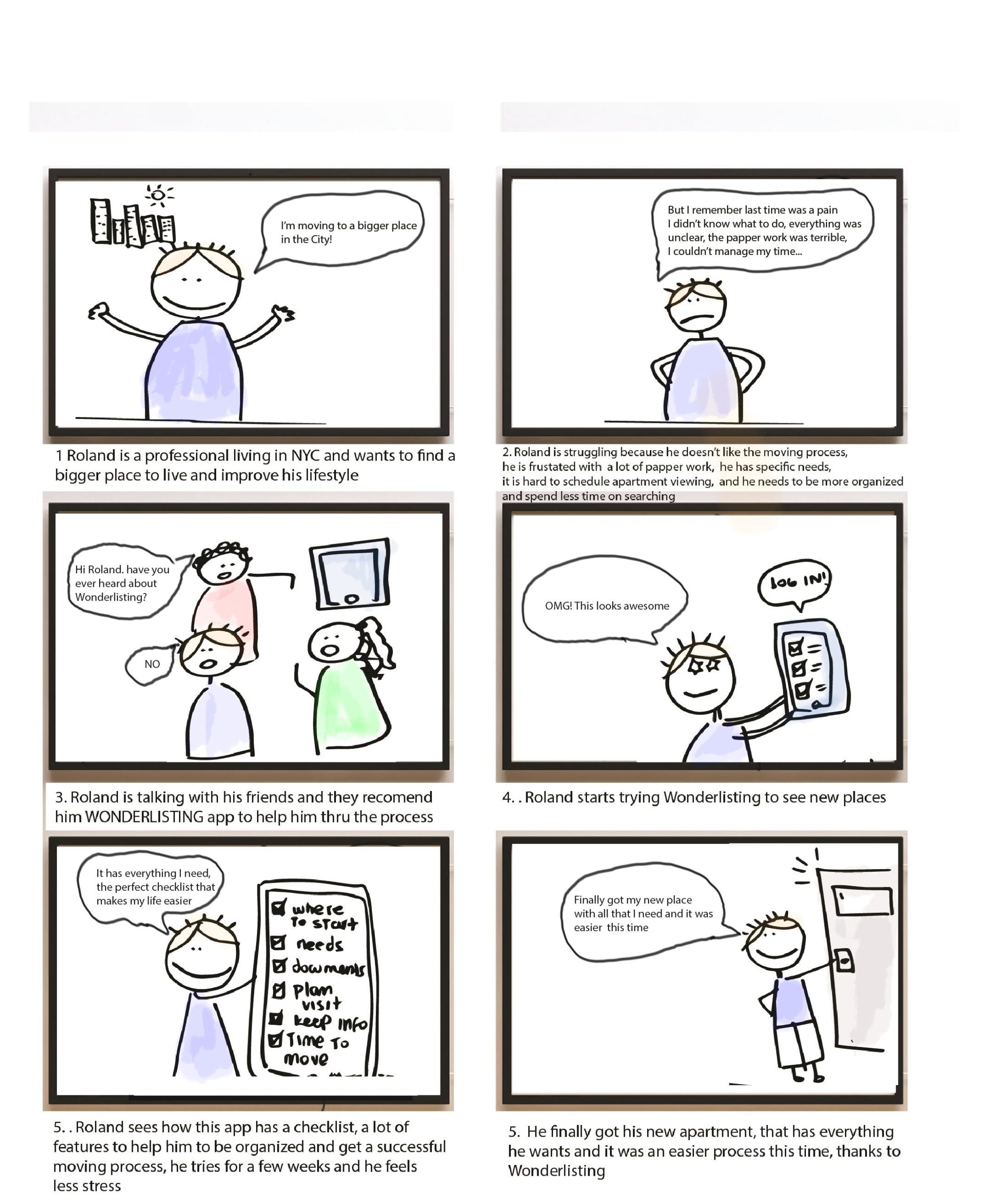
Story Board
This textual storyboard outlines the user journey through the “Rentbox” app, showcasing the key interactions and stages in the house hunting process. Each scene provides a glimpse into the user’s experience and highlights the app’s user centered design and features.
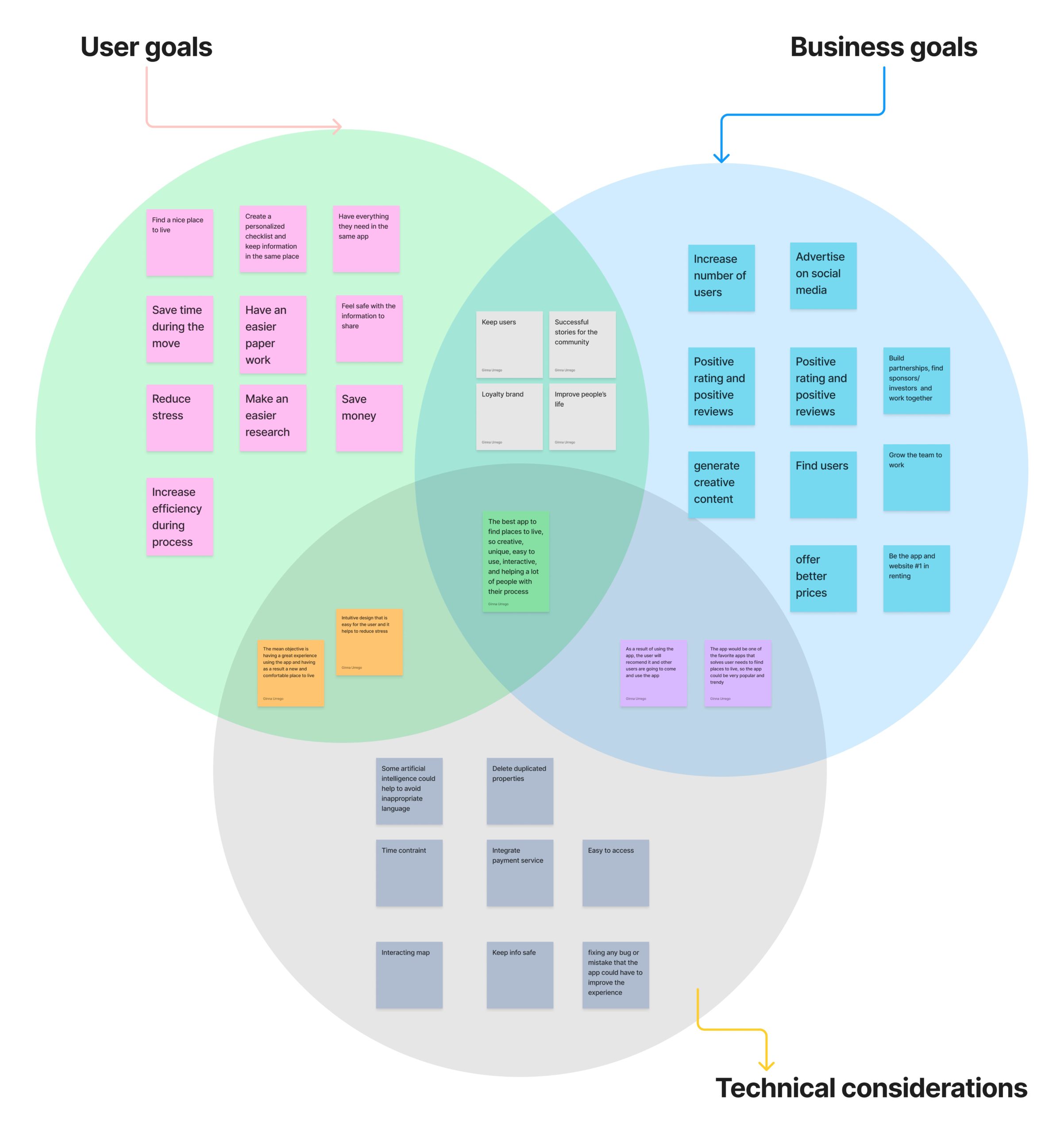
Venn diagram
Imagine a Venn diagram as a puzzle of three circles coming together. Each circle represents something important: one is about what users want, the second is about what the business needs, and the third is about what is technically possible. Where these circles overlap, that’s where the magic happens. It’s where we find solutions that make users happy, help the business grow, and work smoothly with technology. This is like a sweet spot where everyone’s goals meet and create something really awesome.
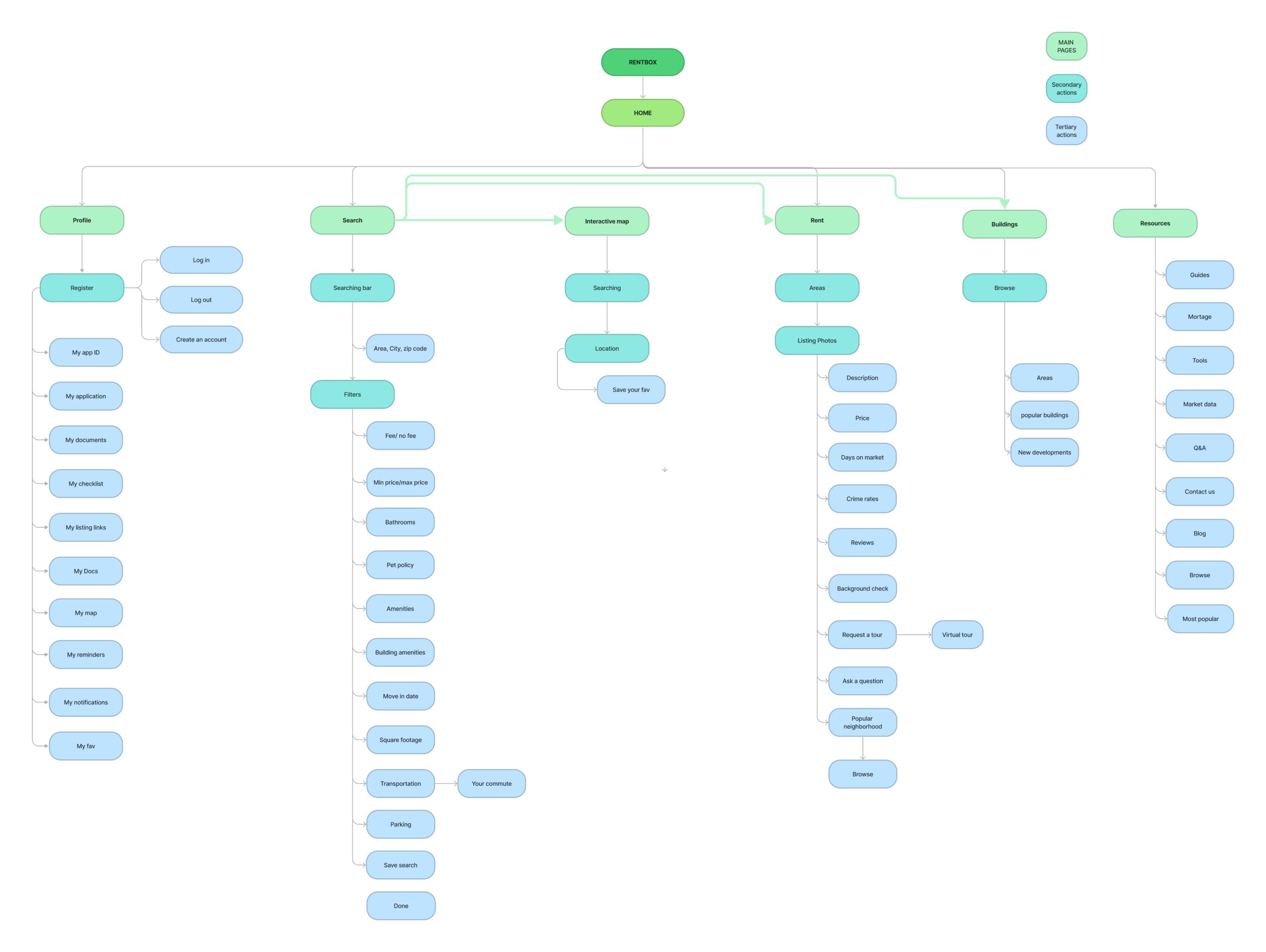
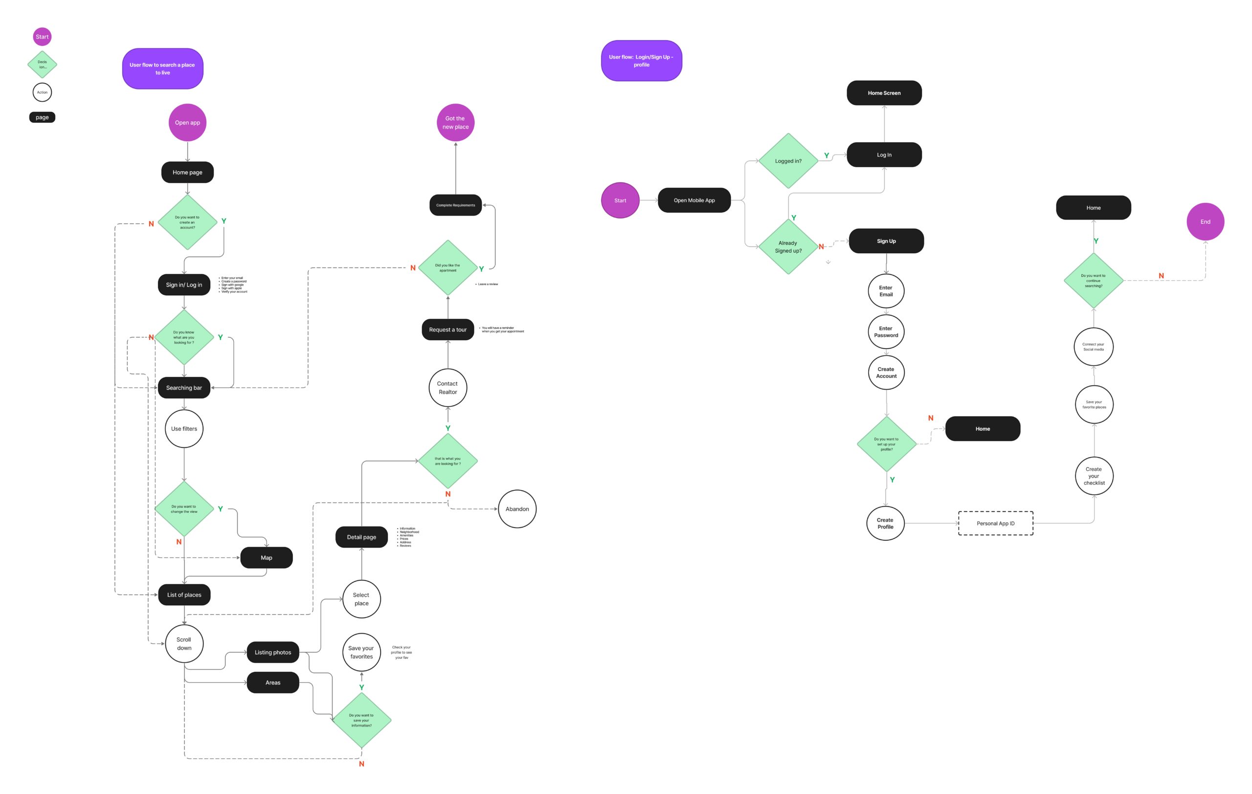
Site map
A site map serves as a visual representation of the app’s structure and navigation flow. It outlines the various screens and features of the app, providing a blueprint for the development process. With this site map, we ensures a smooth user experience by organizing the app’s functionalities in a logical and intuitive manner. Here’s an example of a site map for an app designed to assist users in finding a place to live:
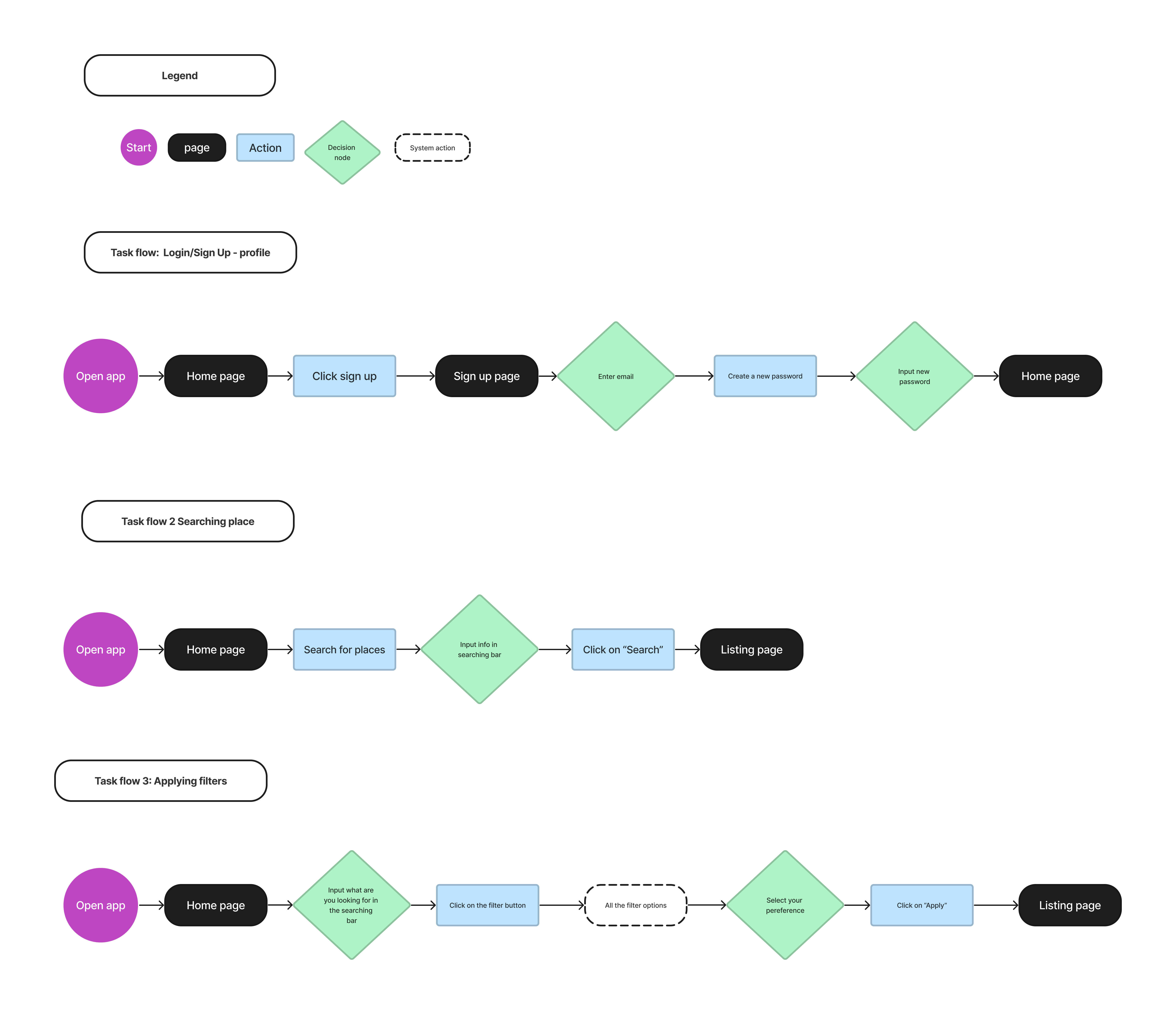
User flow and Task flow
Understanding user needs is a key foundation, and to grasp these needs better, I emphasized the significance of varied features and structures. In pursuit of this understanding, I identified three distinct tasks, each with its own set of steps and sequential actions. Through these task-oriented flows, I aimed to illuminate potential user decisions, unraveling the intricate web of interactions. By presenting diverse screens and pathways, I provided a tangible visualization of how users might engage with the system, offering a comprehensive view of the user journey and interaction possibilities. This approach holistically captured user objectives, fostering an environment where the design aligns seamlessly with user goals and aspirations.
03 Design
The design process in UX/UI is like a creative adventure where we use technology to make digital things easy to use and beautiful. We start by thinking about what people need and then we draw and build to make those ideas real. It’s like putting together a puzzle, where each piece like buttons and pictures fits just right to create something that’s fun, helpful, and easy to understand.
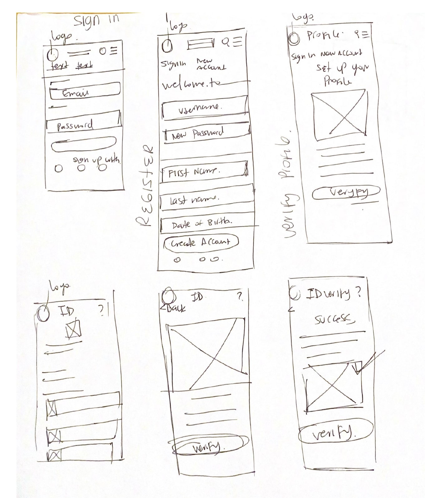
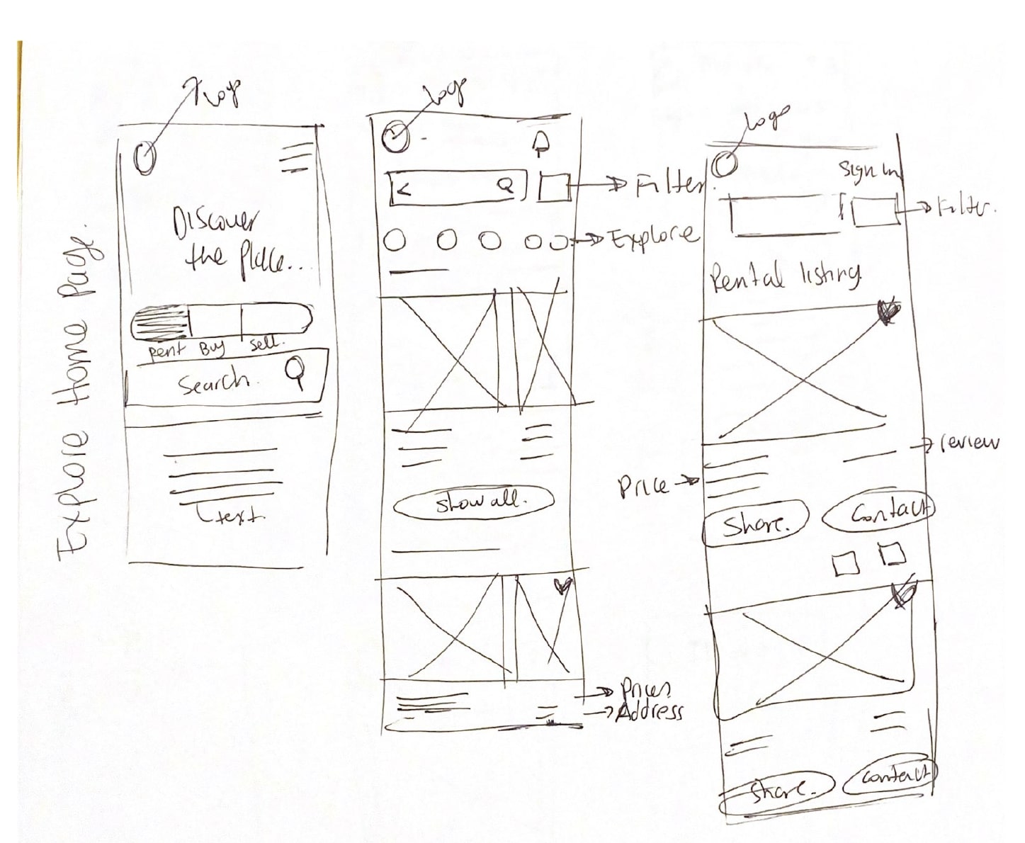
Wireframes
This tool was so helpful because it is the first design to show and validate ideas, so brings clarity to multiple steps and shows different concepts
with basic shapes, I like the fact that is temporary so the important part is to prioritize on a specific key screens, in this case I focused on designing the “sign in“ screen and the “home” screen, then I showed the different elements like where to put images, logo, navigation bar, call to action buttons, some annotations etc.
Low fidelity wireframes
Mid fidelity wireframes
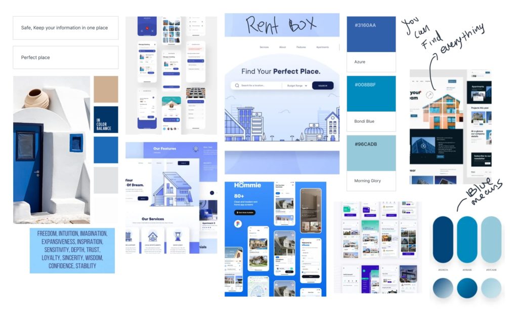
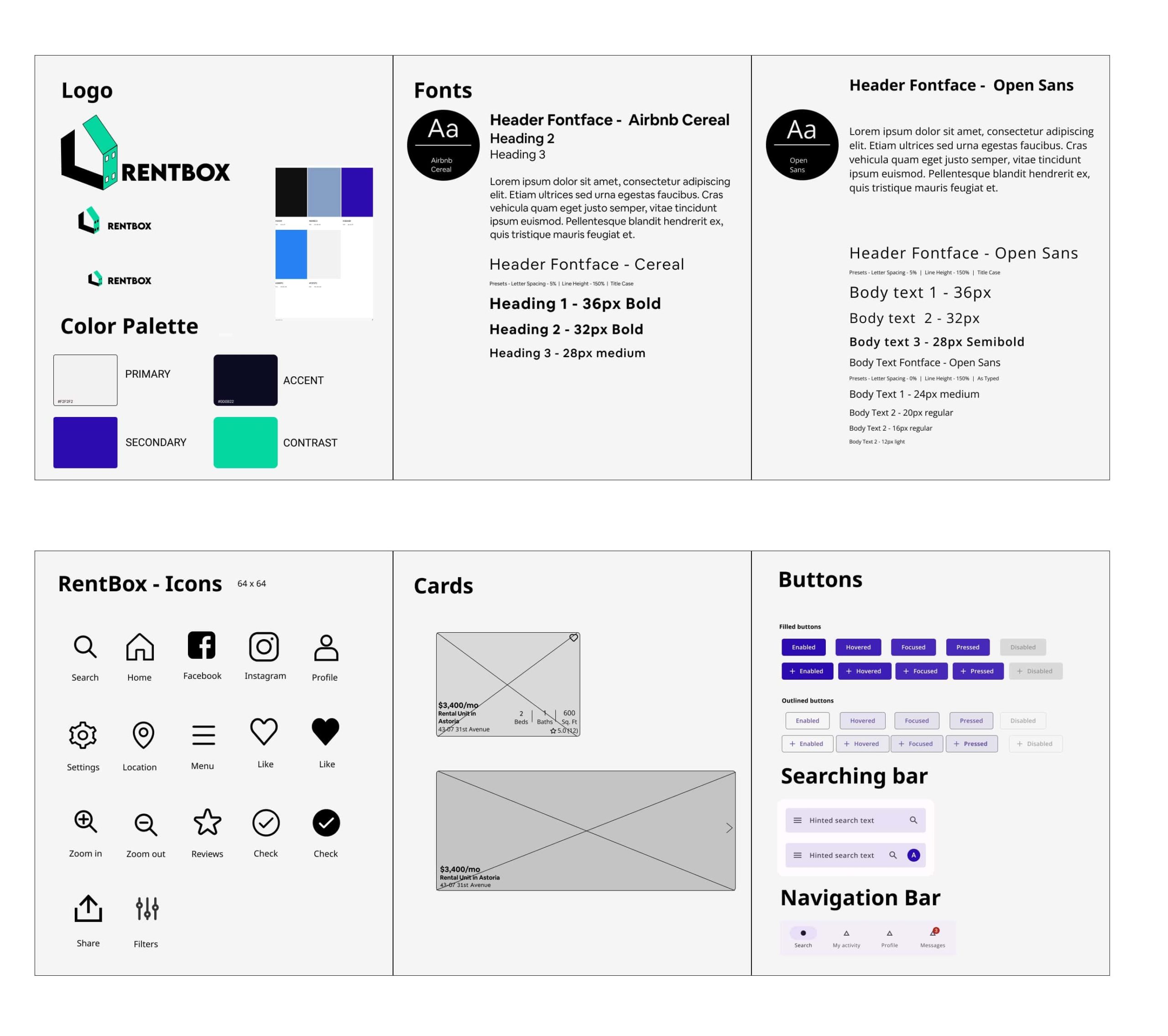
Branding
This project revolves around the psychology of color and its impact on the user experience. Specifically, I have chosen two colors, green and blue, to create a logo and design elements that align with the concept of storage and moving. The logo represents a box, symbolizing the idea of storing and organizing belongings during a relocation. By incorporating these colors and symbols, I aim to convey that my product offers all the necessary resources for individuals to find their ideal living space.
The underlying objective is to create an effortless and user-friendly experience throughout the entire process. Similar to finding everything one needs neatly organized within a box, my app strives to simplify the search for a new home. By implementing intuitive features and a streamlined interface, I aim to make the journey of finding the perfect living space as smooth as possible for the users.
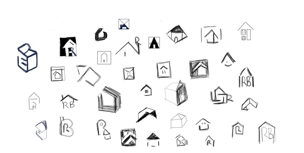
Icon ideas
Mood board and Style tile
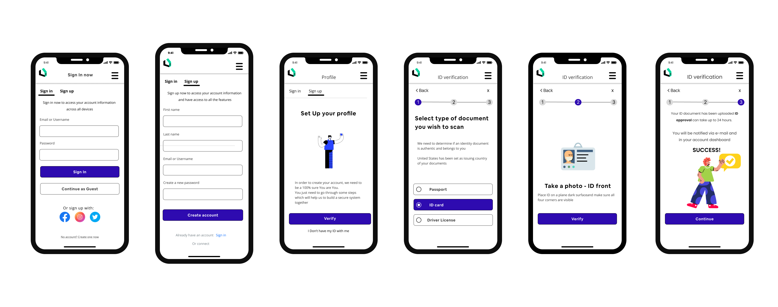
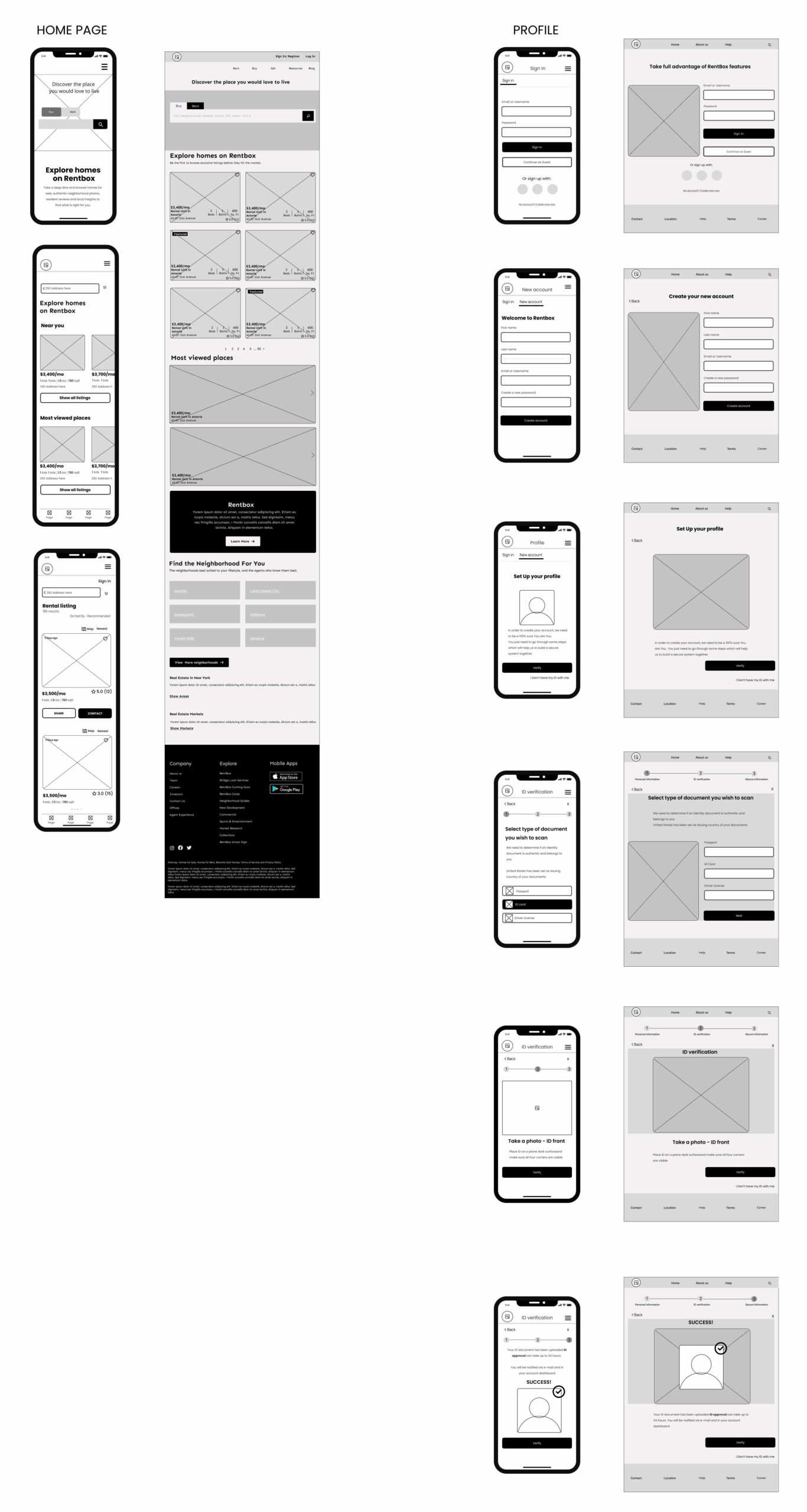
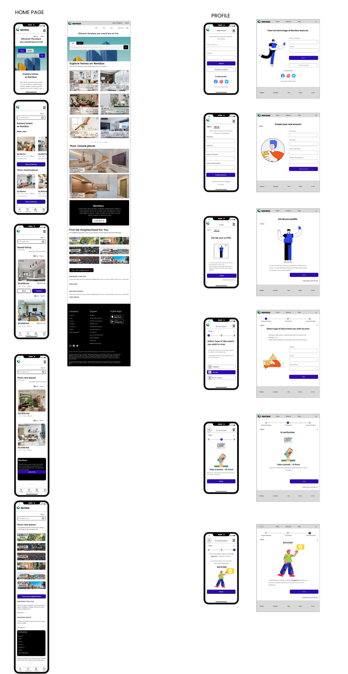
High fidelity wireframes
Testing
To assess the design concept’s performance with our target users, I created a high-fidelity wireframe prototype in Figma. Conducting usability tests with 5 participants, I assigned them 5 main tasks related to our design. This process provided valuable insights to improve the prototype and enhance the user experience.
Tasks
1. Create an account and verify profile, log in/ sign up
2. Find a place to live using the searching bar
3. Search a place applying filters
Through usability testing, we achieved a 100% completion rate, indicating that all participants successfully completed the assigned tasks. Additionally, we observed an 80% error-free rate, with only minor errors occurring during app navigation. These findings highlight the overall effectiveness and usability of the app, while also indicating areas where minor improvements can be made to enhance the user experience.
Usability test results
Before proceeding to high fidelity mockups, I conducted a moderated usability study to test the prototype with five participants. The study involved having users perform various tasks to simulate the intended user flow. This step was crucial in evaluating the usability of the prototype and gathering valuable feedback.
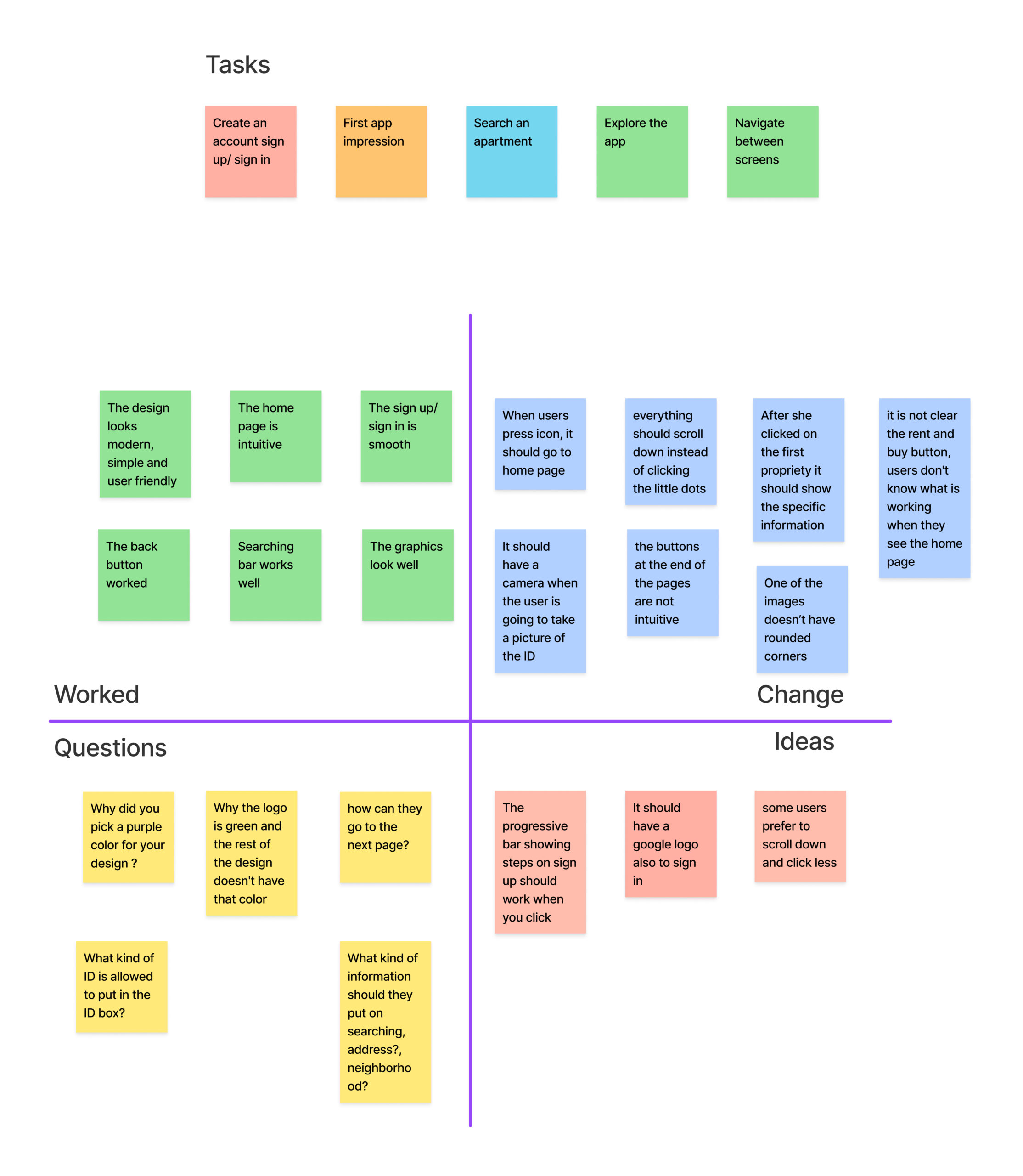
RESULTS
100%
Users found the app’s experience intuitive, easy to use and professional looking
50%
Users preferred to scroll down on the same screen because the previous design was not clear
80%
Users recommended to go to the home screen when they clicked the logo .
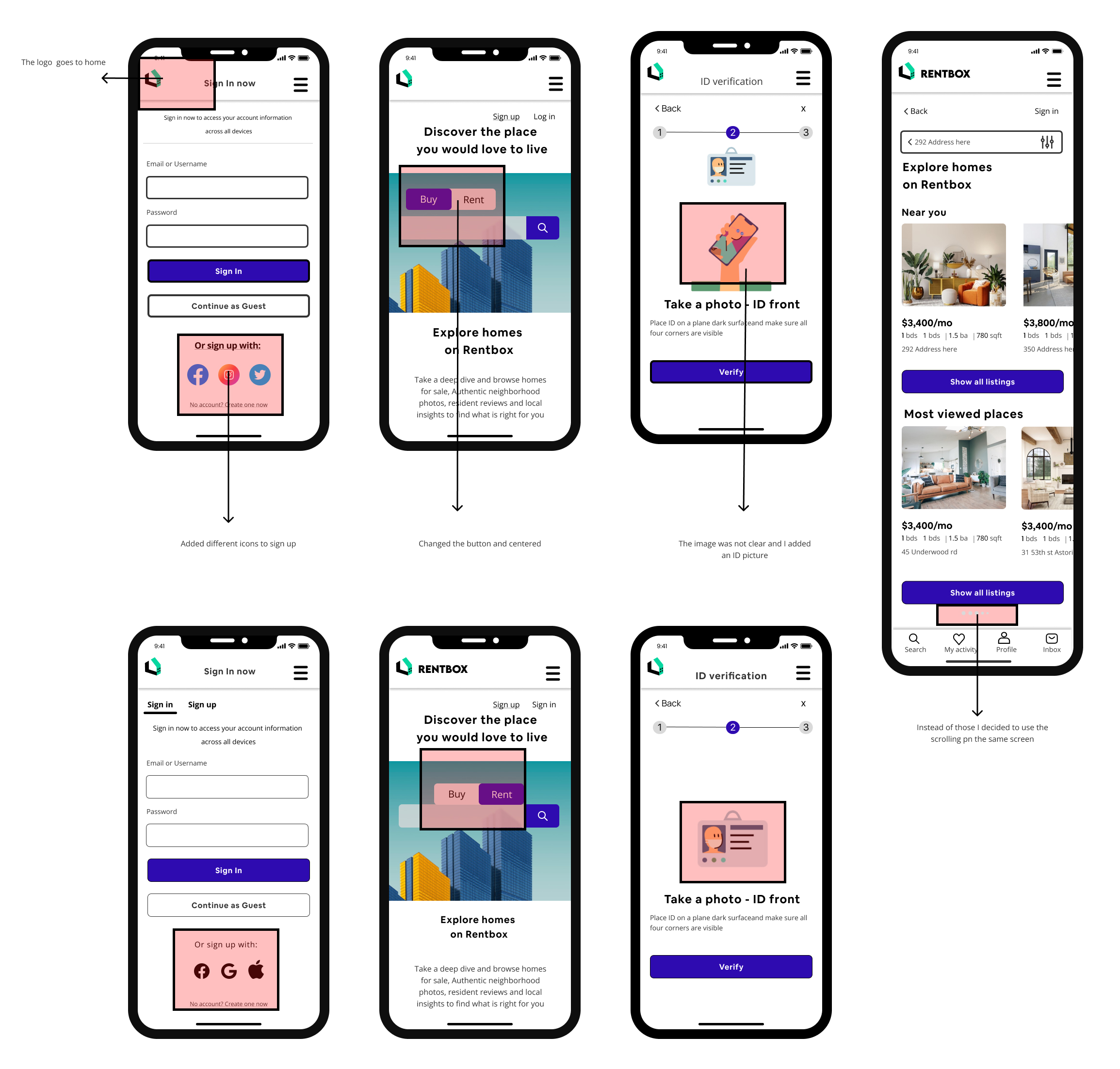
High priority revisions
Overall, the users expressed their liking for the app, describing it as intuitive and professional in appearance. I received positive feedback, which is encouraging considering it was our initial attempt.
However, one common recommendation was to improve the button for navigating to the next pages. Users found it unclear and were often confused by its functionality. They suggested that it would be better to have a continuous scroll feature, allowing all the information to be displayed without the need for a separate button.
Additionally, users mentioned that the logo should be clickable and redirect to the home page, as this would enhance the app’s usability and provide a consistent user experience.
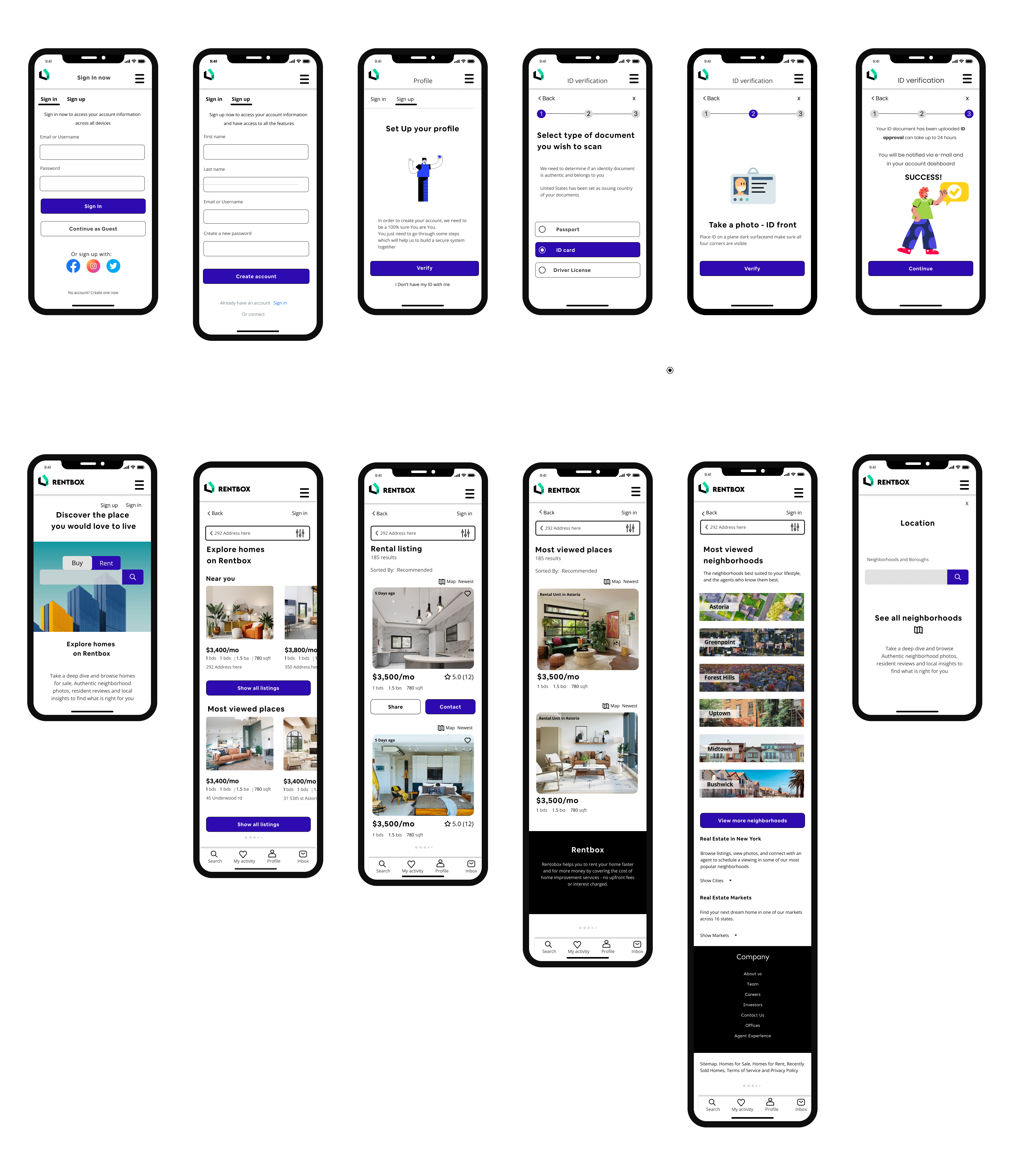
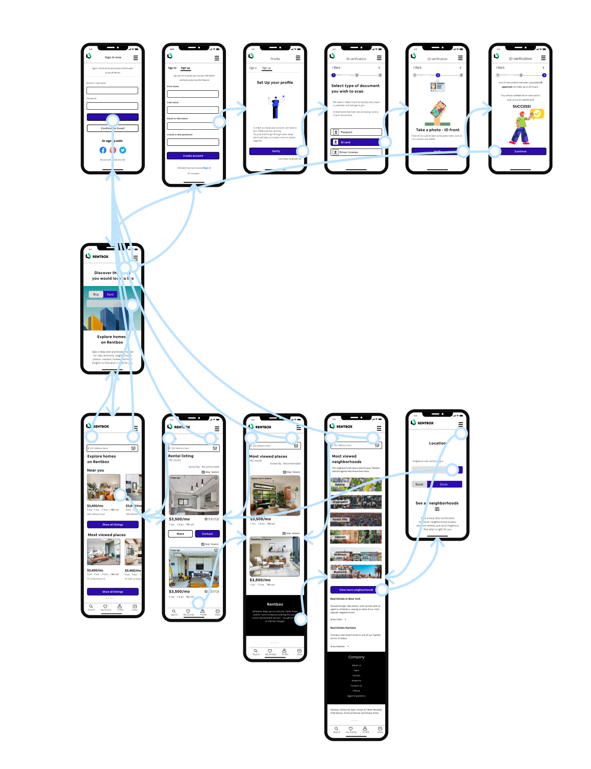
Prototyping
Now that we’ve reached the prototyping stage, we are excited to witness Rentbox taking shape. Figma has been our chosen platform for this phase, and it has proven to be a valuable tool. With its intuitive interface and robust functionality, Figma allows us to create interactive prototypes that showcase the necessary features and functionalities of RentBox.
By leveraging hot spots within Figma, we can simulate user interactions and gather essential feedback on the usability and effectiveness of our design. This enables us to test the functionality of RentBox and make necessary adjustments early on in the development process. It’s truly gratifying to see the product evolve and come to life as we iterate and refine the prototype based on user insights.
The prototyping stage in Figma not only serves as a visual representation of RentBox but also provides a tangible experience for testing and validation. It allows us to evaluate the user experience and make informed decisions on improving the product’s design and functionality. With each iteration, we are one step closer to creating a remarkable and user-friendly solution with RentBox.
Reflections and takeaways
Figma
Creating Figma components is crucial for smoothly resizing and recreating product pages on different devices. This helps maintain good performance and a great user experience. When moving from designing apps to webpages, I faced a new challenge. Adapting my design skills for a website was a valuable learning experience.
Designing
Designing an app while keeping the right balance of text and images, was tough. Making sure everything works together for a smooth user experience needed careful thought and creativity.
Interviews
Adding to the complexity, conducting interviews for collecting data can be difficult due to the time and effort involved. However, this step is crucial for truly understanding user needs and improving the design based on real insights.
What is next
Looking ahead, we are crafting detailed mobile screens to help you find a new place to live, ensuring a smooth journey every step of the way. Our development roadmap is getting a boost with exciting new features and future possibilities that’ll make your search even more delightful.
We’re not stopping there, we’re putting our design to the test with real users, refining it based on their valuable feedback. We are introducing fresh property search options and fine tuning them to match their preferences.
And here’s something really cool: we’re creating a special pathway for you to customize your property search. This will allow you to effortlessly filter and sort through listings, saving you precious time and helping you discover your ideal home.
These upcoming steps are all about you making sure your experience with us is streamlined, enjoyable, and efficient in your search for a new place to call home.