
Sept- November 2023
Venmo
Venmo is a widely used mobile payment application that facilitates effortless peer to peer financial transactions. Acquired by PayPal, Venmo allows users to send and receive money from friends and different contacts, sharing expenses conveniently
through a user friendly interface. Notably, it adds a social element by enabling users to include notes, emojis, and transaction descriptions, creating a more interactive and engaging payment experience. Furthermore, Venmo offers options for linking bank accounts, debit cards, and credit cards, making it a versatile tool for managing personal finances and settling payments in an increasingly cashless society.
Problem
This case study addresses the need for improved group payment functionality within Venmo. Currently, Venmo evenly divides group payments among participants, prompting the need for a more flexible approach. Despite its user friendly reputation, Venmo lacks effective tools for splitting expenses among friends or groups, leading users to resort to manual calculations. My research highlights this as a significant
shortcoming and drives our mission to enhance Venmo’s group payment capabilities, streamlining the user experience
Background
Venmo, is a widely used mobile payment app known for its ease of use and social payment features. Launched in 2009, it has transformed how people exchange money, making transactions with friends, family, and acquaintances more convenient and interactive through its platform. offering a user friendly platform for sending and receiving money, often accompanied by playful emojis and transaction descriptions
Role
Lead UX/UI designer
Skills
- Figma
- Figma Jam
- Zoom
- Illustrator
- Maze
- Notion
- Miro
- Otter.ai
Process
- Empathize
- Define
- Design
- Prototype
- Test
- Reflect
Primary Research
The primary research methodology contributed to a comprehensive understanding of the landscape, enabling us to discern vital areas for improvement and innovation within bill splitting features across peer to peer payment platforms. By comparing different payment platforms we aimed to gather insights into the strengths, weaknesses, and distinctive features of competing apps concerning their bill splitting functionalities.
Competitor analysis
The competitive analysis scrutinized leading peer to peer payment platforms like PayPal, Cash App, and Zelle, specifically focusing on their functionalities.
Competitor analysis
Through this analysis, we had an approach revealing insights into the strengths, weaknesses, and distinctive traits of each platform, highlighting areas for enhancement and innovation in bill splitting features across these payment apps.

01 Empathize
Research goal
We want to gather insights and data that will inform the redesign of Venmo’s group payment
functionality. The ultimate objective is to create a more user centric and efficient solution.
Objectives
- Understand User Pain Points: Identify the specific challenges and frustrations users encounter when using Venmo for group payments.
- Assess User Needs: Determine what features and functionalities users expect from a group payment system within a mobile payment app like Venmo.
- Evaluate Competitor Solutions: Analyze how other mobile payment apps handle group payments to identify best practices and potential areas of differentiation.
- Gather User Feedback on Prototypes: Test and gather feedback on proposed changes and prototypes related to group payments to refine the design.
Interviewees
Surveys
Minutes interview
02 Define
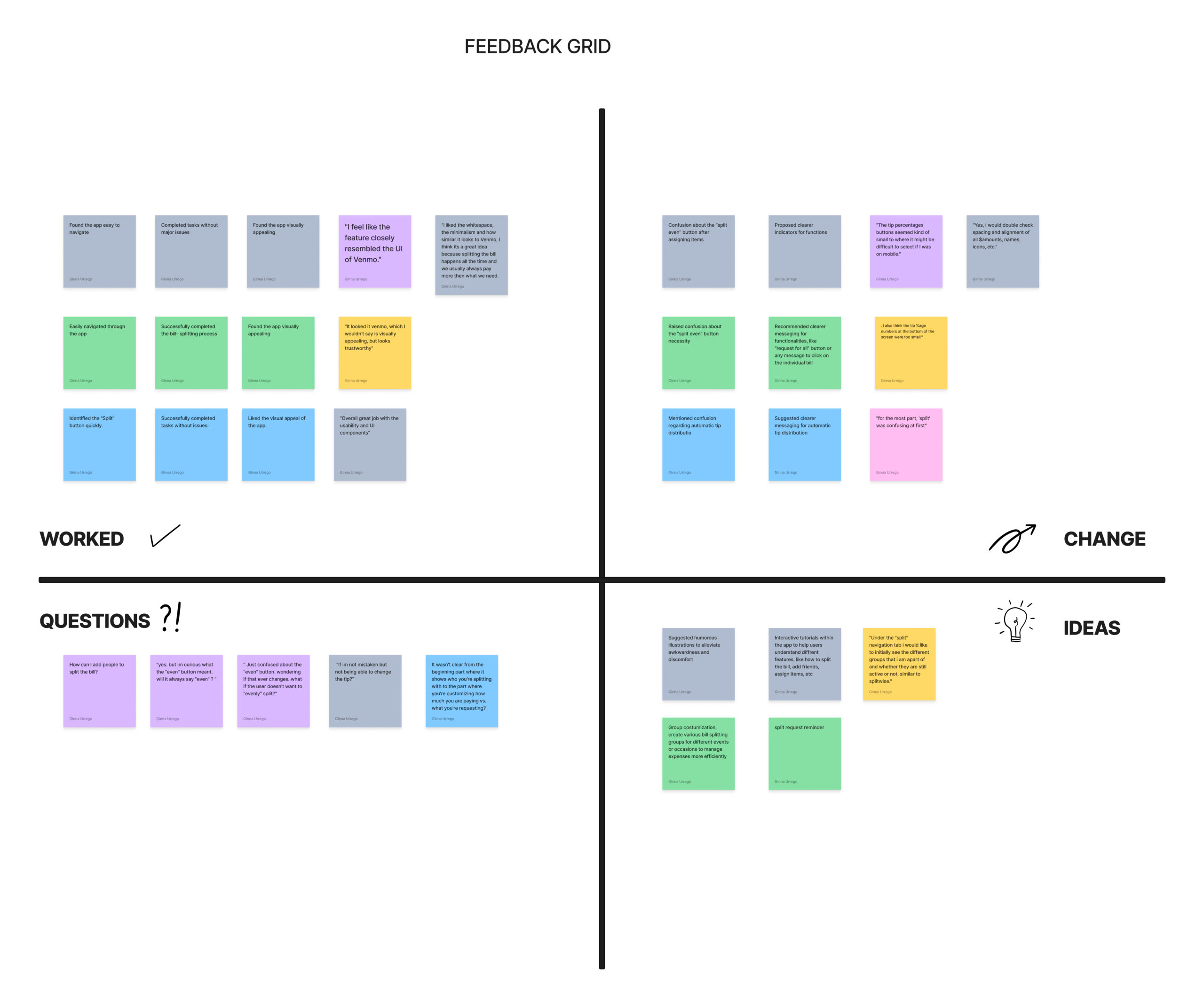
Affinity map
This method is very helpful because it is Human centered design and it is crucial to hear from users in their own words. It is also a good way to learn about a person’s mindset, interests, emotions, behavior, and lifestyle when it is time to make a decision
Synthesis Debrief
After conducting interviews with 4 participants and collecting feedback from 12 surveys, found some highlights showing the importance of customization and privacy in group payments within Venmo. Users appreciate the app’s ease of use and speed but express concerns about the lack of customization options. Improving these aspects while maintaining a user -friendly experience could lead to a more satisfying and secure payment platform for Venmo users.
Important things to consider:

1
The survey findings highlight the importance of customization and privacy in group payments within Venmo. Users appreciate the app’s ease of use and speed but express concerns about the lack of customization options. Improving these aspects while maintaining a user friendly experience could lead to a more satisfying and secure payment platform for Venmo users.
2
One prominent finding from my interviews was that all users relied on their phone calculators to determine how to divide costs when splitting a bill. Some users expressed a neutral experience with this approach, while others found it time consuming, especially in larger groups where expenses needed to be distributed among multiple participants.
3
Another noteworthy discovery in our research was that all users believed a bill splitting feature would be beneficial to some extent. They highlighted that such a feature would save them time and streamline the payment process, particularly when they were managing group payments. Users often resort to manual requests to individuals when they owe different amounts, as Venmo currently lacks the functionality to manually split total costs among users
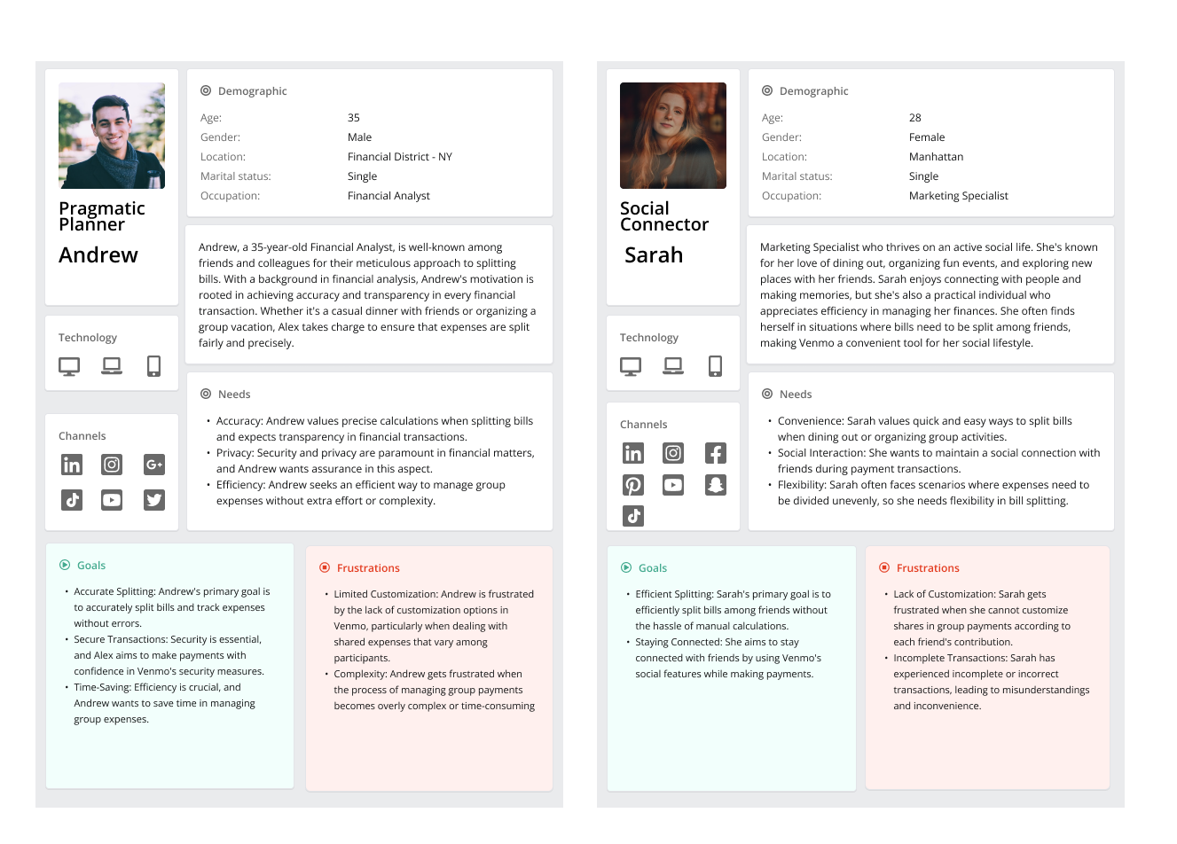
User Persona
Cafting user personas involves synthesizing data from primary research, such as interviews and observations, to create archetypal users who engage with the Venmo app. These personas encapsulate demographic information, technological proficiency, pain points, and expectations related to bill-splitting functionalities.
03 Ideate
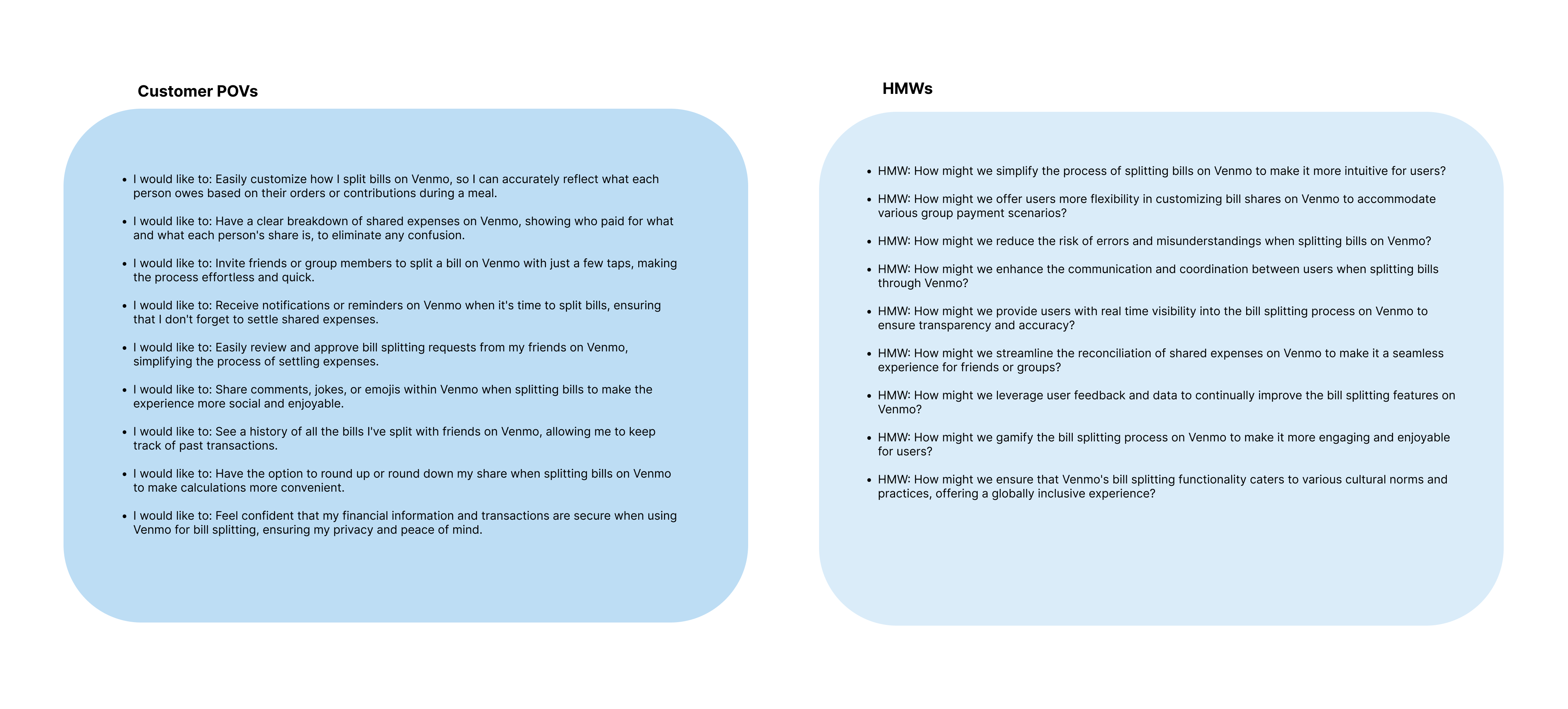
How might we (HMW)
1.
Help designers focus their design attention on opportunities
2.
Respond to the needs and insights uncovered during the research
3.
Generate targeted ideas.
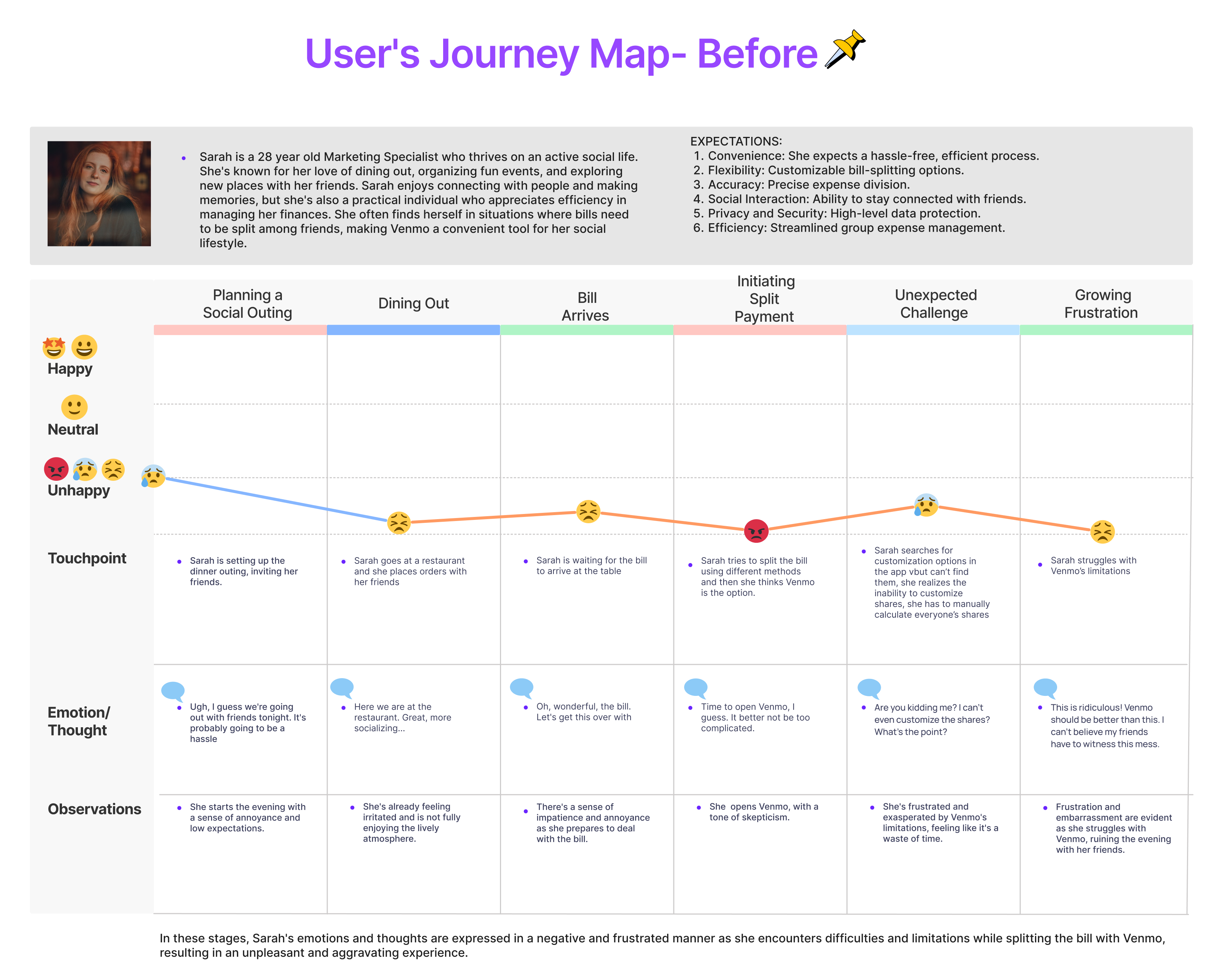
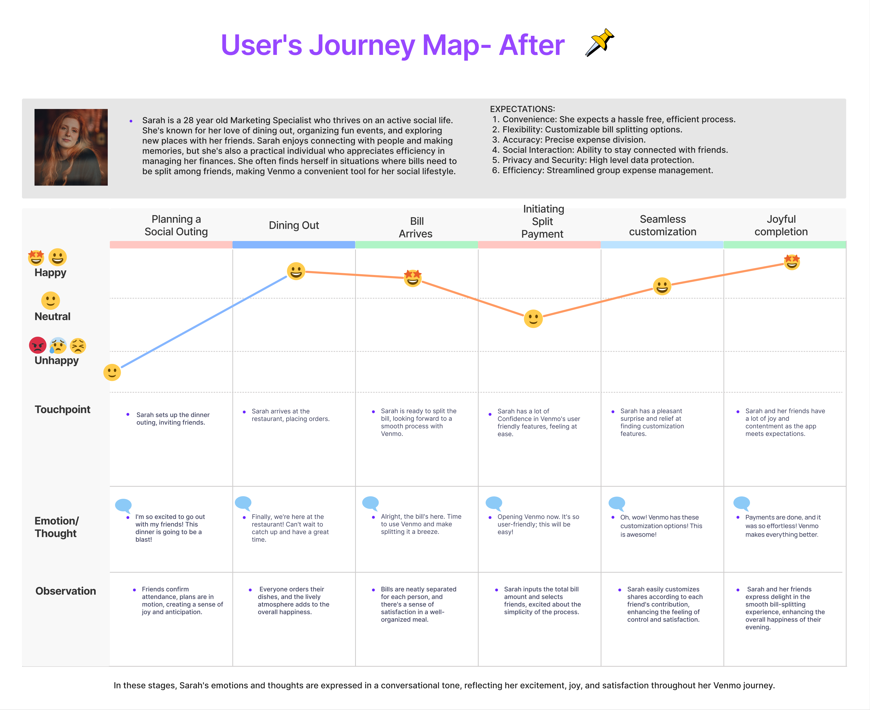
Journey map
The function of a journey map, particularly in the context of Bloomup’s image consulting project, is to comprehensively illustrate the user’s entire experience from their initial encounter with the website to booking appointments. It offers a user-centric perspective, fostering empathy and understanding of user needs and challenges. By pinpointing pain points and uncovering opportunities for enhancement, the journey map guides the team in refining user interactions. This visualization fosters cross-functional alignment, aids iterative improvements, and serves as a communication tool for stakeholders. Ultimately, it empowers Bloomup’s team to create a seamless and empathetic user experience that aligns with the project’s goals and the users’ expectations.
Road map
Site map
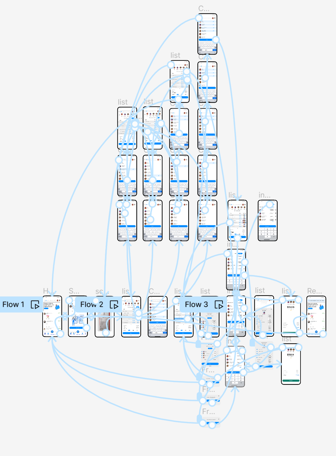
Venmo’s site map is a visual representation of the app’s navigational structure, providing a hierarchical overview of its main sections and features. The site map outlines the user journey, starting from the homepage and branching into key areas such as the user dashboard, transaction history, and social features. It delineates the pathways users can take to access functionalities like splitting bills, making payments, and managing account settings. This organized and intuitive structure enhances user experience by facilitating seamless navigation and ensuring that users can easily find and engage with the various features Venmo offers. The site map serves as a foundational tool for UX design, ensuring coherence and efficiency in the overall structure of the Venmo app.
User flow and Task flow
These flows contribute to the development of a seamless and user friendly experience, ensuring that users can effortlessly accomplish tasks like bill splitting while maintaining an understanding of their broader navigation within the Venmo app. These design methodologies are pivotal in crafting an app that not only meets user expectations but also enhances user satisfaction through intuitive and efficient interactions.
03 Design
The design process in UX/UI is like a creative adventure where we use technology to make digital things easy to use and beautiful. We start by thinking about what people need and then we draw and build to make those ideas real. It’s like putting together a puzzle, where each piece like buttons and pictures fits just right to create something that’s fun, helpful, and easy to understand.
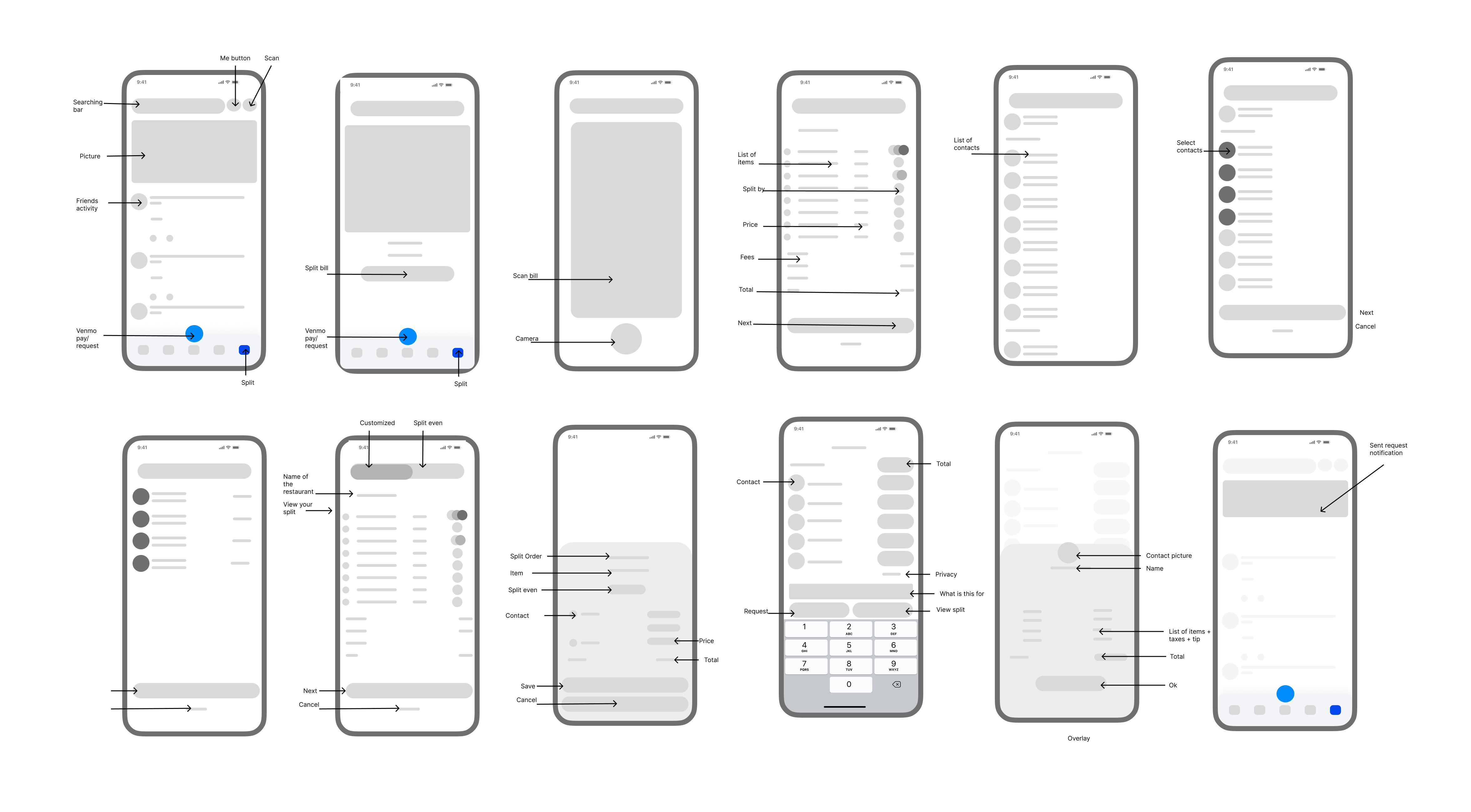
Wireframes
Wireframes were incredibly beneficial in the Venmo project as they served as the initial visual representation to conceptualize and validate ideas. These low-fidelity representations are instrumental in eliciting early feedback, ensuring that the core functionalities, such as bill splitting features, are intuitively structured and meet user expectations. As a crucial step in the design iteration process, wireframes set the foundation for the eventual creation of high-fidelity prototypes, contributing to the development of an intuitive and user centric Venmo app.
Low fidelity wireframes
Branding
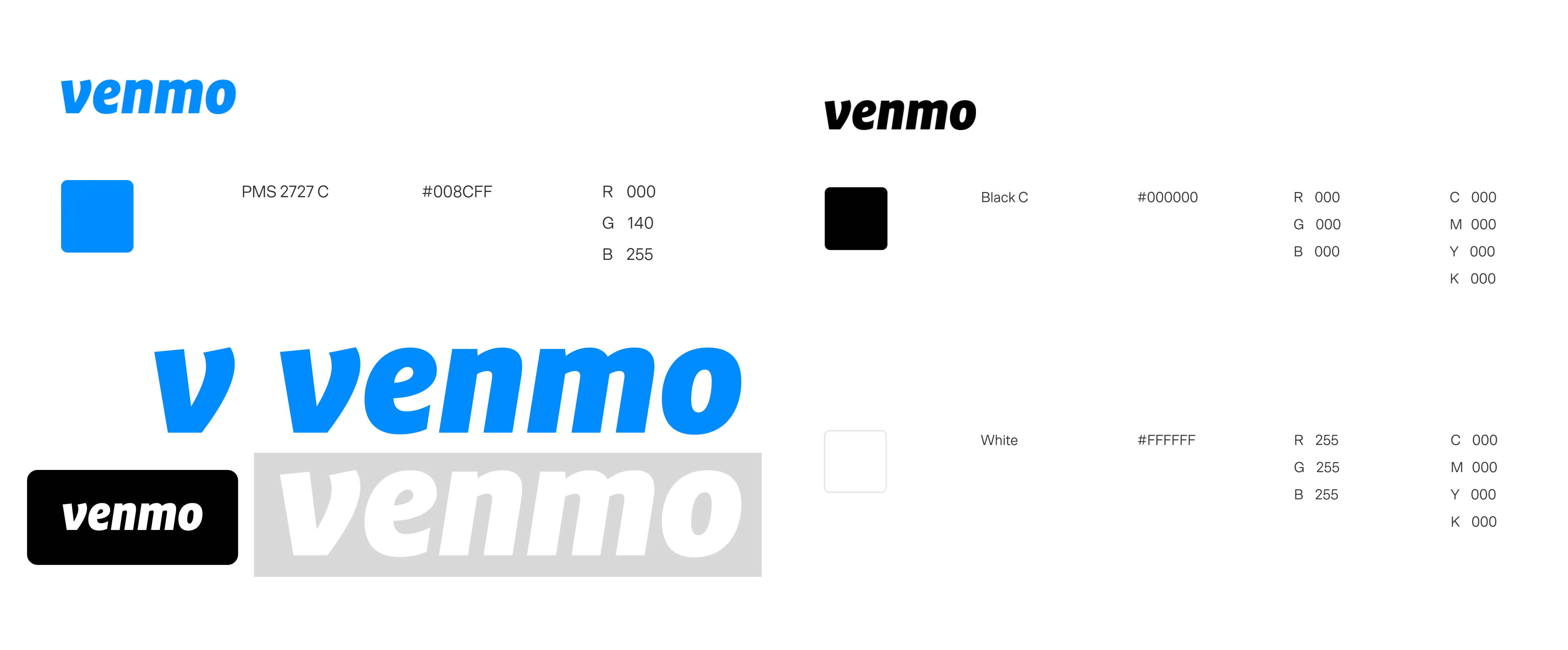
Venmo’s branding is characterized by its vibrant, approachable, and user-friendly identity. The brand employs a distinctive combination of a playful color palette, featuring shades of blue, green, and white, creating an inviting and dynamic visual appeal. The use of casual and rounded typography further enhances the brand’s friendliness, reflecting a modern and accessible persona. Venmo’s logo, incorporating the familiar “double V” symbol, not only reinforces brand recognition but also signifies the ease and speed associated with its payment services. The overall branding strategy is geared towards fostering a sense of trust and simplicity, aligning with the platform’s mission to make financial transactions, including bill-splitting among friends, a seamless and enjoyable experience. The brand’s tone, reflected in its communications, is conversational and lighthearted, contributing to Venmo’s identity as a socially connected and user-centric financial platform.
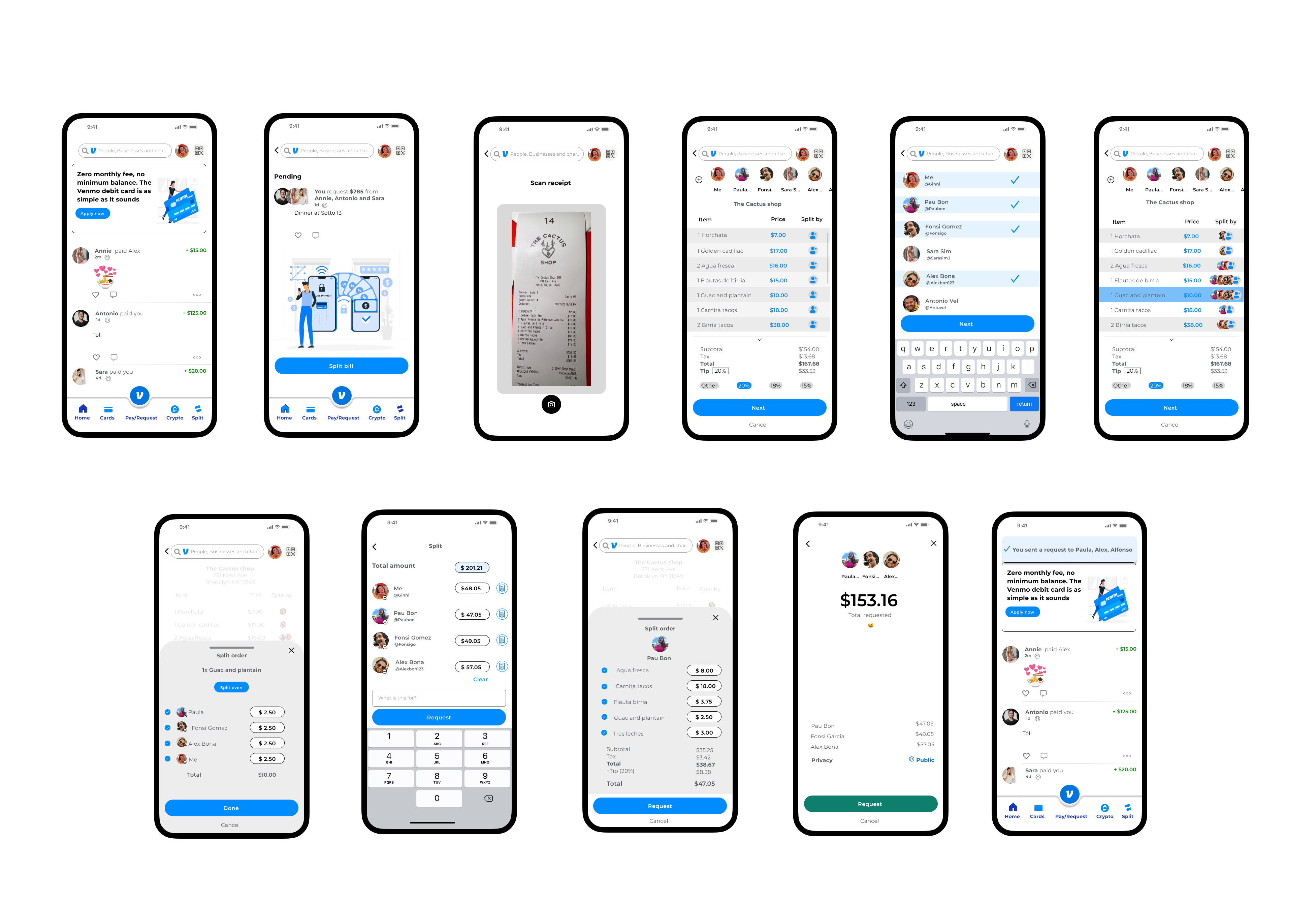
High fidelity wireframes
Testing
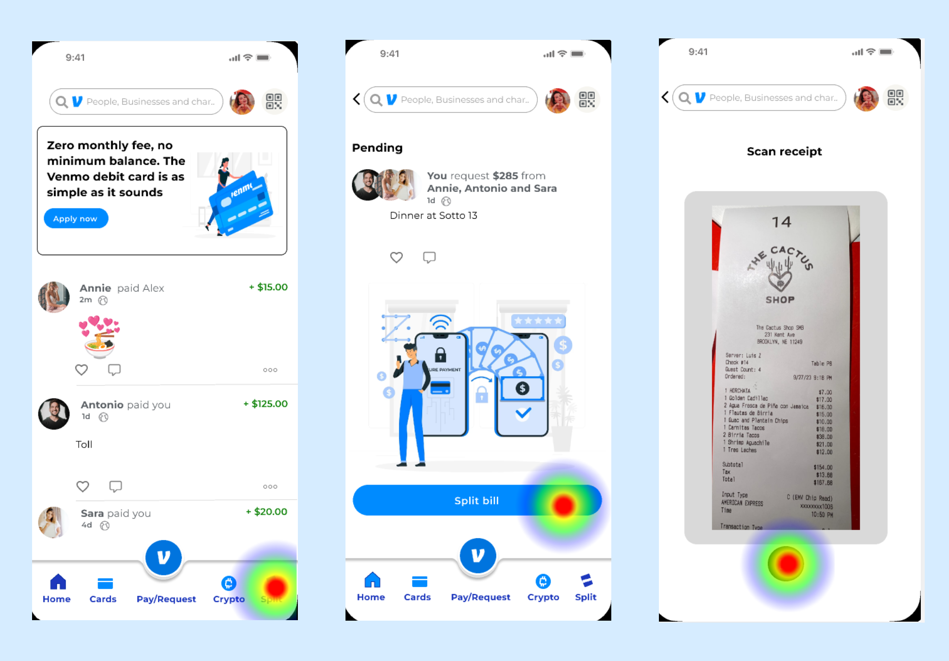
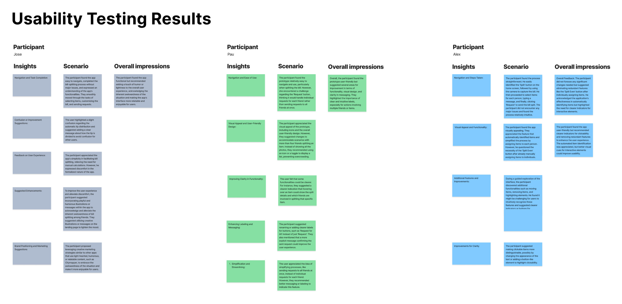
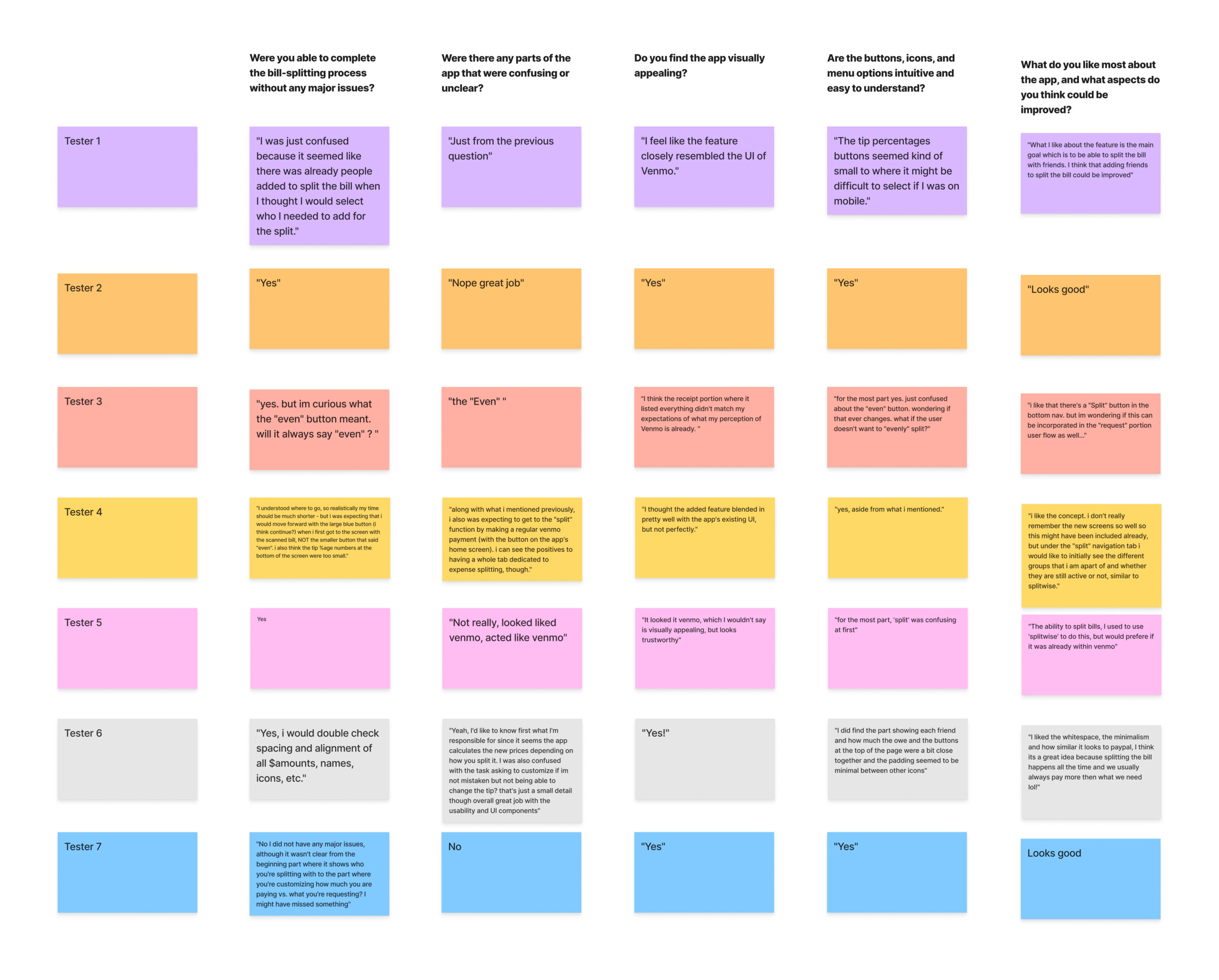
I crafted a high fidelity wireframe prototype using Figma. By engaging 3 participants in usability tests with 3 specific tasks, and also testing 11 people on Maze. I gained valuable insights to refine the prototype and enhance user experience.
Tasks
Before moving on to the detailed designs, I tested the prototype with 14 users in a usability study. They did different tasks to see how well the prototype worked and to get feedback. This helped check if the prototype was easy to use and find any areas that needed improvement. This feedback will be used to make the final designs better.
- Scan the receipt
- Customize the bill
- Sending a request to friends
Task 1:Scan the receipt
In this phase, most users easily figured out where to click and successfully completed the task.
Task 2: customize the bill
During this phase, users encountered challenges as some clicked on unintended buttons, “even button”, leading to confusion. Additionally, there were complaints about the “tip” button, indicating a source of user frustration. They also noted that the icon next to the user, indicating the receipt for viewing individual bills, was not clickable, posing a usability concern.
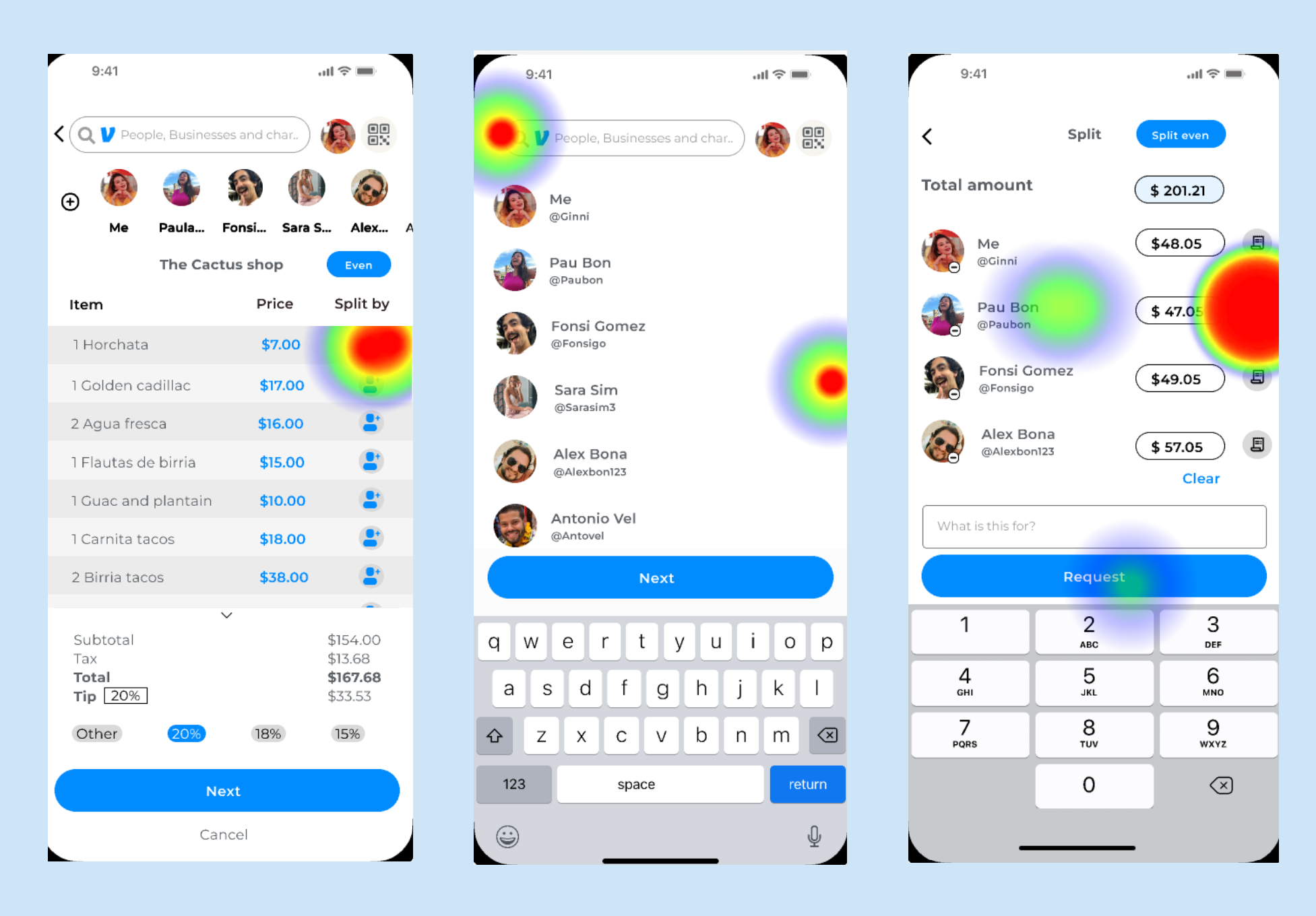
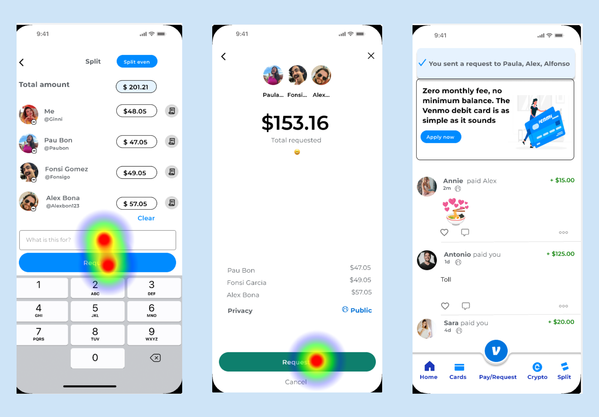
Task 3: sending a request to friends
Once users grasped the preceding tasks, the third one—sending a request—proved to be straightforward for all, showcasing the seamless flow once users became familiar with the platform’s functionalities.
Usability test results
In synthesizing the research data, my focus was on identifying and addressing any usability issues encountered by users during the testing phase. The success criteria for this prototype centered around user willingness to adopt the new feature if incorporated into Venmo’s existing app. Encouragingly, 10 out of 14 users expressed their intent to use this feature, emphasizing its appeal as a swift and efficient solution for itemizing and splitting bills. This positive feedback underscores the prototype’s potential for enhancing the user experience within the Venmo platform.
RESULTS
90%
Users found the feature easy to navigate, and complete the tasks with major issues
60%
Users said the ” split even button” was confusing and the individual receipt button was not clickable
100%
All users unanimously expressed the app’s usefulness and said Venmo should have the option to customize bills
High priority revisions
Overall, the testing had positive outcomes as all users successfully completed the tasks. Feedback from the users highlighted the website’s refreshing and user friendly nature, coupled with easy navigation. They said it had unique and professional appearance. However, there were recommendations for improvement, notably in terms of spacing between elements and alternative methods for interacting with images. Some participants pointed out that certain images were too small and exhibited pixelation issues, which emerged as areas for enhancement.
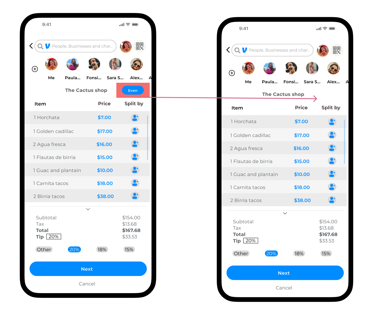
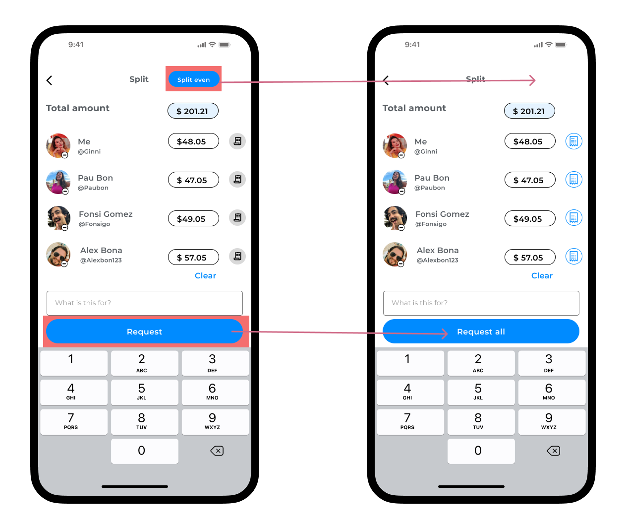
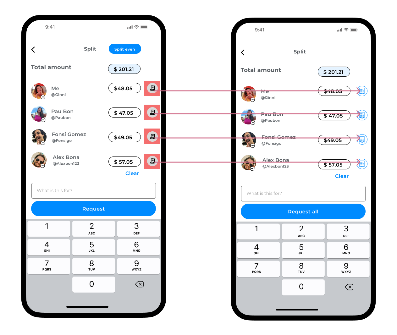
Prototyping
The process of splitting a bill starts with the addition of a “Split” button, strategically placed within the app’s interface. This button acts as a gateway, signaling the introduction of a new feature for customizable bill splitting. Once users click on the “Split” button, they are seamlessly directed to a “Scan the Receipt” screen. Here, users leverage the app’s scanning capabilities to capture a digital version of the physical bill, transforming it into a convenient and editable format. With the digital bill in hand, users are then guided to a customization screen where they can effortlessly tailor individual expenses, add or remove items, and adjust shares. Finally, users navigate through the intuitive interface to send a request to friends, utilizing the newly customized bill. This streamlined process aims to provide users with a comprehensive and user friendly experience, offering a seamless flow from initiating the bill split to customizing and requesting payments within the Venmo app.
Reflections and takeaways
Figma
In my journey, I embraced the opportunity to learn and experiment with Figma, a powerful design tool. Had challenges in maintaining consistency across different components and screens but the platform’s adaptability allowed for swift adjustments based on team feedback.
Designing
Designing the new Venmo feature had challenges in balancing innovation with familiarity. The challenge lay in infusing creativity, using the design principles while ensuring a seamless integration with Venmo’s existing design language. This iterative approach helped refine the visuals and interactions for a fresh and user friendly bill-splitting experience.
Interviews
Scheduling interviews was challenging, but once conducted, a common thread emerged: every participant had faced difficulties and discomfort when splitting bills. This universal experience underscored the importance of addressing these challenges in the design solution.
What is next
The UX case progresses from design to implementation and testing phases. Acknowledging the vital role of clear language, a collaboration with a UX writer is under consideration to optimize button wording, addressing challenges like user confusion with the “request” button. While adjusting to “request all” was proactive, a UX writer’s input aims for further optimization. Post prototype, the focus turns to refining with user feedback, planning implementation, and crafting user education strategies for a seamless feature launch, closely monitored for performance and satisfaction. The documented case study reflects on key learnings and insights for future enhancements.